
Frontend
Building a Design System: From Tokens to Components
Design tokens, component APIs, and the organizational patterns that make a design system a force multiplier instead of a maintenance burden.
·3 min read
Tags
14 articles
Design tokens, component APIs, and the organizational patterns that make a design system a force multiplier instead of a maintenance burden.

How to structure CSS in large applications — design tokens, component patterns, utility classes, and the principles that prevent stylesheet entropy over time.

A hands-on guide to building responsive layouts with CSS container queries and subgrid, covering component-level responsiveness, alignment inheritance, and practical patterns for card grids and dashboards.

A hands-on guide to creating performant scroll-driven animations using native CSS scroll timelines, view transitions, and the animation-timeline property without any JavaScript dependencies.

Build truly responsive components with CSS container queries that adapt based on their container's size rather than the viewport, enabling reusable layouts that work in sidebars, modals, and main content areas without change.
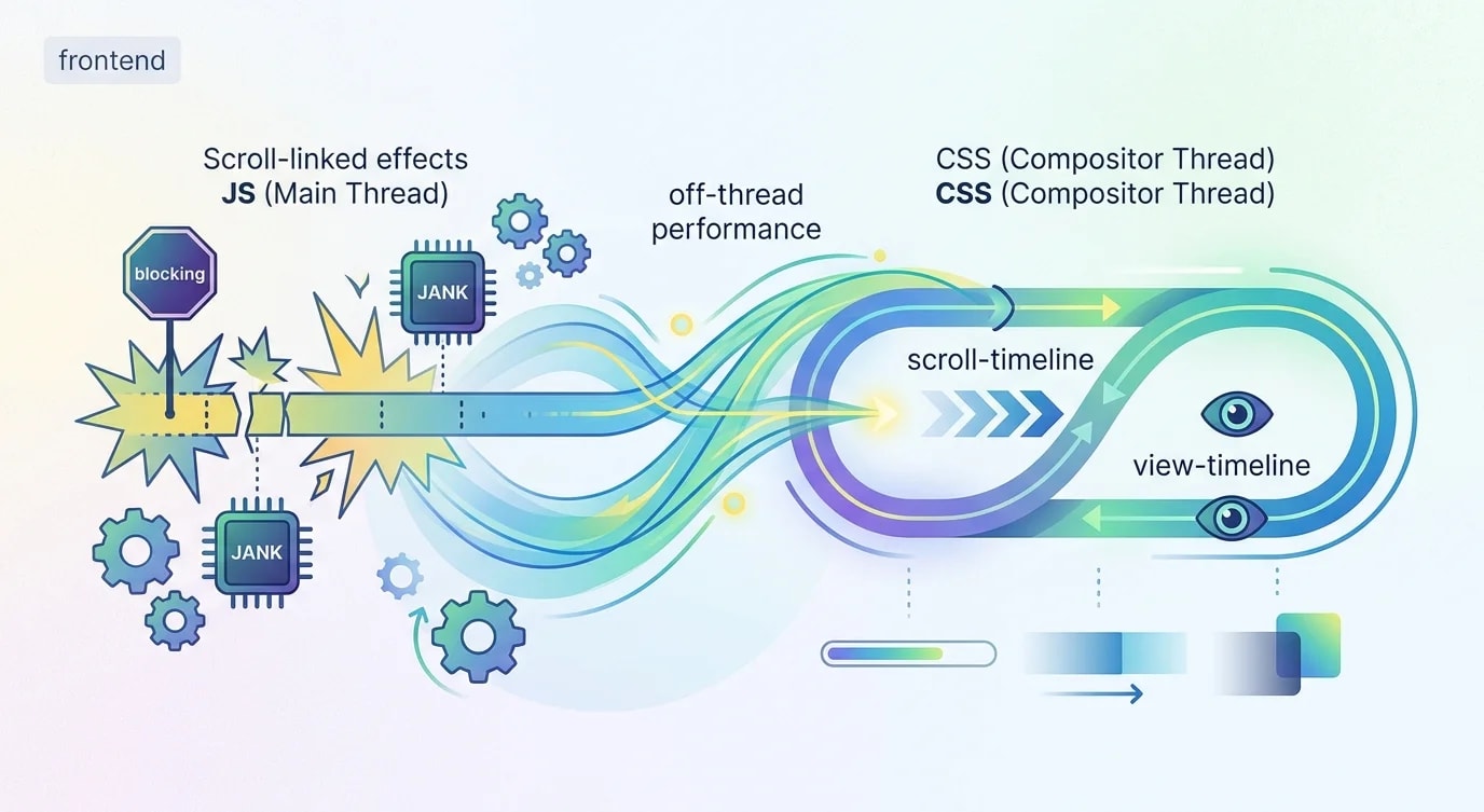
Build performant scroll-linked animations using CSS scroll-driven animations API with practical examples of scroll progress timelines, view timelines, parallax effects, and sticky header transforms that run entirely off the main thread.
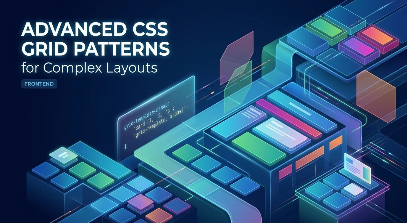
Master advanced CSS Grid techniques including subgrid, named grid areas with responsive reflow, auto-placement algorithms, intrinsic sizing with minmax, and grid-aware component composition for production layouts.
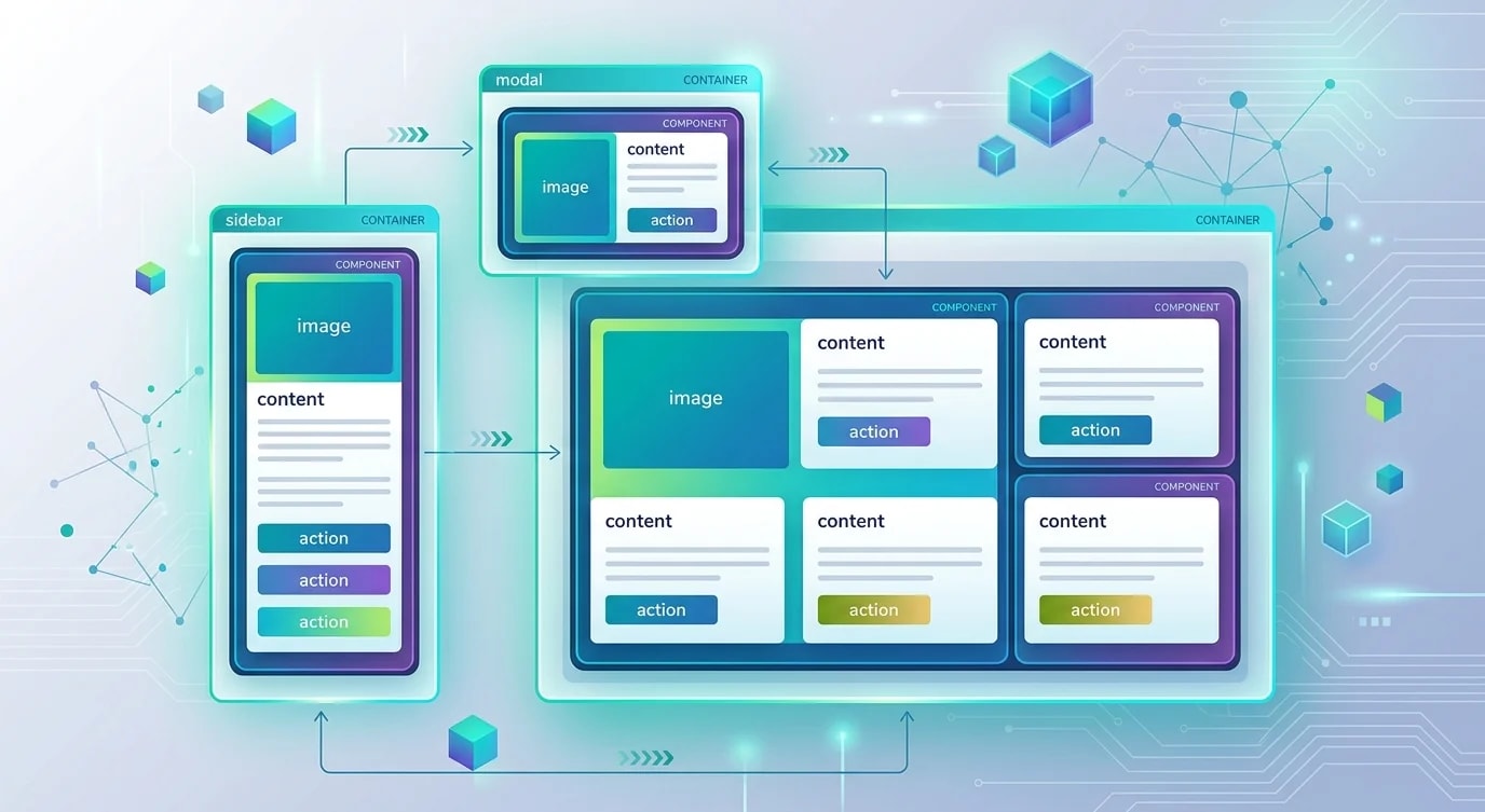
Learn how CSS container queries let you build truly responsive components that adapt to their parent's size rather than the viewport, enabling portable UI modules that work in any layout context.

Master practical CSS layout patterns using Grid, Flexbox, container queries, and logical properties that solve real-world responsive design challenges without JavaScript or complex media query chains.

Master GPU-accelerated CSS and JavaScript animation techniques that deliver consistent 60fps performance without triggering layout thrashing or janky frame drops.

How CSS container queries let components respond to their parent's size instead of the viewport — enabling truly reusable responsive components.

How design tokens create a single source of truth for colors, spacing, and typography across design tools and code — eliminating drift between Figma and production.

Container queries, fluid typography, intrinsic sizing, and CSS clamp() — modern responsive design techniques that reduce media query dependency and create truly flexible layouts.

CSS Grid enables two-dimensional layouts that were previously impossible without hacks — learn the grid model, placement rules, and responsive patterns that replace float-based layouts.