Portable UI Modules with CSS Container Queries
How CSS container queries let you build components that adapt to their parent's size rather than the viewport, producing UI modules portable to any layout.
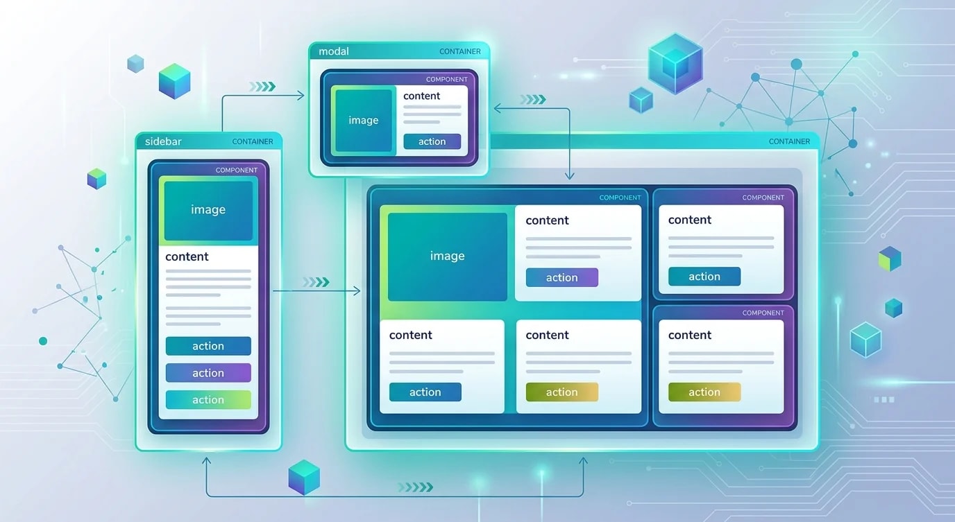
Media queries taught us responsive design, but they answer the wrong question. "How wide is the viewport?" doesn't help a card component that renders in a sidebar, a main content area, and a modal dialog—all at the same viewport width. Container queries fix this by asking: "How wide is my parent?"
This shift from global viewport awareness to local container awareness transforms how we build component libraries. Components become self-contained responsive modules that adapt to wherever they're placed.
The Container Query Fundamentals
Container queries require two pieces: declaring a containment context on a parent element, and writing size-based queries against that container.
/* ❌ Media queries — component doesn't know its context */
.card {
  display: grid;
  grid-template-columns: 1fr;
}

@media (min-width: 768px) {
  .card {
    grid-template-columns: 200px 1fr;
  }
}
/* This breaks when .card is in a narrow sidebar at 1024px *//* ✅ Container queries — component responds to parent size */
.card-wrapper {
container-type: inline-size;
container-name: card;
}
.card {
display: grid;
grid-template-columns: 1fr;
}
@container card (min-width: 400px) {
.card {
grid-template-columns: 200px 1fr;
}
}
@container card (min-width: 600px) {
.card {
grid-template-columns: 250px 1fr auto;
}
}The container-type: inline-size establishes size containment on the inline axis. You can also use size for both axes, but inline-size is the common choice since most layouts only need width-based responsiveness.
Container Query Units
Container queries introduce new units that reference the container's dimensions, similar to how viewport units reference the viewport.
.card-wrapper {
  container-type: inline-size;
}

.card-title {
  /* 5% of the container's inline size */
  font-size: clamp(1rem, 5cqi, 2rem);
}

.card-image {
  /* Fixed height that scales with container */
  height: 30cqb;
}

.card-body {
  /* Padding relative to container width */
  padding: 2cqi;
}
The units are cqw (container query width), cqh (height), cqi (inline size), cqb (block size), cqmin (smaller dimension), and cqmax (larger dimension). These follow the same logical property model as margin-inline or padding-block.
Building a Responsive Product Card
A real product card needs to handle at least three layout contexts: narrow (sidebar, mobile), medium (grid cell), and wide (featured slot). Container queries handle all three without knowing where the card appears.
/* Container setup */
.product-card-container {
  container-type: inline-size;
  container-name: product;
}

/* Base: stacked layout for narrow containers */
.product-card {
  display: grid;
  grid-template-areas:
    "image"
    "content"
    "actions";
  gap: 1rem;
  padding: 1rem;
  border-radius: 8px;
  background: var(--surface-1);
}

.product-card__image {
  grid-area: image;
  aspect-ratio: 16 / 9;
  object-fit: cover;
  border-radius: 4px;
  width: 100%;
}

.product-card__content {
  grid-area: content;
}

.product-card__actions {
  grid-area: actions;
  display: flex;
  gap: 0.5rem;
}

/* Medium: side-by-side layout */
@container product (min-width: 480px) {
  .product-card {
    grid-template-areas:
      "image content"
      "image actions";
    grid-template-columns: 200px 1fr;
    grid-template-rows: 1fr auto;
  }

  .product-card__image {
    aspect-ratio: 1;
    height: 100%;
  }

  .product-card__actions {
    justify-content: flex-end;
  }
}

/* Wide: featured layout with more detail */
@container product (min-width: 720px) {
  .product-card {
    grid-template-areas:
      "image content actions";
    grid-template-columns: 280px 1fr auto;
    align-items: center;
  }

  .product-card__image {
    aspect-ratio: 4 / 3;
  }

  .product-card__actions {
    flex-direction: column;
    align-self: center;
  }
}
This single component definition works in a two-column grid, a sidebar widget, a modal, or a full-width featured section. No JavaScript. No prop-based responsive switching. The CSS handles it.
Nested Containers and Style Queries
Containers can nest, and each @container rule targets the nearest matching container unless you specify a name. Style queries extend this pattern by letting you query computed style values on a container.
/* Nested container setup */
.dashboard-panel {
  container-type: inline-size;
  container-name: panel;
}

.widget-slot {
  container-type: inline-size;
  container-name: widget;
}

/* Target specific containers by name */
@container panel (min-width: 800px) {
  .widget-slot {
    display: grid;
    grid-template-columns: repeat(2, 1fr);
  }
}

@container widget (min-width: 300px) {
  .metric-card {
    flex-direction: row;
    align-items: center;
  }

  .metric-card__value {
    font-size: 2rem;
  }
}

/* Style queries — respond to custom property values */
@container style(--theme: compact) {
  .metric-card {
    padding: 0.5rem;
    gap: 0.25rem;
  }

  .metric-card__label {
    font-size: 0.75rem;
  }
}

@container style(--theme: spacious) {
  .metric-card {
    padding: 1.5rem;
    gap: 1rem;
  }

  .metric-card__label {
    font-size: 1rem;
  }
}
Style queries are still gaining browser support, but they unlock a powerful pattern: parent components can set custom properties that child components respond to, without JavaScript. A panel component sets --theme: compact when it's in a dense layout, and all children adjust automatically.
Integration with Component Frameworks
Modern component libraries benefit from container queries as a styling primitive. Here's how to integrate them cleanly with React components.
// ❌ JavaScript-based responsive switching
function ProductCard({ layout }: { layout: "narrow" | "wide" }) {
  return (
    <div className={`card card--${layout}`}>
      {/* Parent must know and pass layout variants */}
    </div>
  );
}// ✅ Container query-based — component adapts automatically
function ProductCard({
product,
}: {
product: { name: string; price: number; image: string };
}) {
return (
<div className="product-card-container">
<article className="product-card">
<img
className="product-card__image"
src={product.image}
alt={product.name}
loading="lazy"
/>
<div className="product-card__content">
<h3>{product.name}</h3>
<p className="product-card__price">
${product.price.toFixed(2)}
</p>
</div>
<div className="product-card__actions">
<button type="button">Add to Cart</button>
</div>
</article>
</div>
);
}
// Works everywhere — no layout prop needed
function App() {
return (
<>
<aside className="sidebar">
<ProductCard product={featured} />
</aside>
<main className="content-grid">
{products.map((p) => (
<ProductCard key={p.id} product={p} />
))}
</main>
</>
);
}The key insight is that the container declaration lives on the component's own wrapper element. The component creates its own containment context, making it fully portable.
Practical Migration Strategy
You don't need to rewrite all media queries at once. Container queries and media queries coexist. The practical migration path starts at the component level.
/* Step 1: Add container context to layout regions */
.main-content { container-type: inline-size; }
.sidebar { container-type: inline-size; }
.modal-body { container-type: inline-size; }

/* Step 2: Convert component media queries to container queries */
/* Keep page-level layout media queries as-is */
@media (min-width: 768px) {
  .page-layout {
    grid-template-columns: 300px 1fr;
  }
}

/* Convert component-level queries to container queries */
@container (min-width: 400px) {
  .card { grid-template-columns: 150px 1fr; }
}

/* Step 3: Use feature detection for progressive enhancement */
@supports (container-type: inline-size) {
  .card-wrapper {
    container-type: inline-size;
  }

  @container (min-width: 400px) {
    .card {
      grid-template-columns: 150px 1fr;
    }
  }
}

@supports not (container-type: inline-size) {
  @media (min-width: 768px) {
    .card {
      grid-template-columns: 150px 1fr;
    }
  }
}
Key Takeaways
Container queries shift responsive design from viewport-centric to component-centric, letting components adapt based on the space they actually occupy rather than the browser window width. The container-type: inline-size declaration establishes containment, while @container rules query against the nearest named or unnamed container ancestor. Container query units (cqi, cqb, cqw, cqh) let font sizes, padding, and dimensions scale relative to the container rather than the viewport. Nesting containers with explicit names gives you precise control over which ancestor a query targets. Style queries extend this model by letting children respond to custom property values set by their container, enabling theme-like switching without JavaScript. The migration path is incremental—keep media queries for page-level layout decisions and adopt container queries for component-level responsiveness, using @supports for progressive enhancement in mixed-support environments.