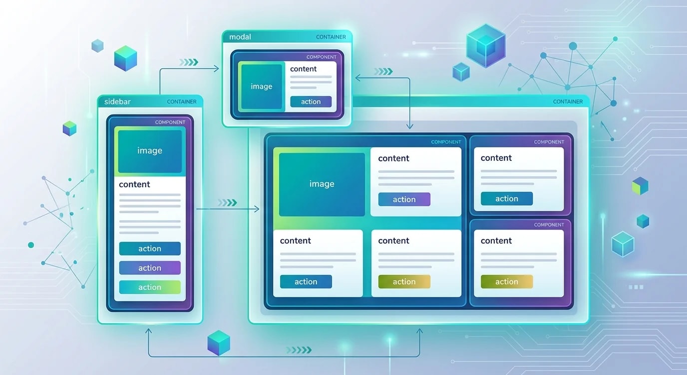
Building a Design System: From Tokens to Components
Design tokens, component APIs, and the organizational patterns that make a design system a force multiplier instead of a maintenance burden.

Most design systems start as a component library and end up as a bottleneck. Teams copy components into their own repos to move faster, the library falls out of sync, and you end up with three slightly different buttons across four products. The problem is usually not technical — it's architectural. Getting the foundations right from the start prevents the drift.
Start With Tokens, Not Components
Design tokens are the atomic layer: named values for color, spacing, typography, and radius that live in one place and flow outward. Building components before establishing tokens means you'll hardcode values everywhere and refactor forever.
// tokens.ts — the single source of truth
export const tokens = {
  color: {
    brand: {
      50: "#eff6ff",
      500: "#3b82f6",
      600: "#2563eb",
      900: "#1e3a8a",
    },
    semantic: {
      primary: "var(--color-brand-500)",
      danger: "var(--color-red-500)",
      success: "var(--color-green-500)",
      warning: "var(--color-yellow-500)",
    },
  },
  spacing: {
    1: "0.25rem",
    2: "0.5rem",
    4: "1rem",
    8: "2rem",
    16: "4rem",
  },
  radius: {
    sm: "0.25rem",
    md: "0.375rem",
    lg: "0.5rem",
    full: "9999px",
  },
} as const;
Generate CSS custom properties from these tokens as part of your build. Every component references var(--color-brand-500), not #3b82f6. Theming becomes a variable swap, not a grep-and-replace.
Designing Component APIs That Age Well
The biggest maintenance cost in a design system is component API churn. Props added hastily become permanent — you can never remove them without breaking consumers. Design APIs as if you'll never be able to change them.
// ❌ Prop explosion — every feature request adds a prop
interface ButtonProps {
  label: string;
  isLoading: boolean;
  isDisabled: boolean;
  isFullWidth: boolean;
  iconLeft?: React.ReactNode;
  iconRight?: React.ReactNode;
  loadingText?: string;
  onClick: () => void;
}

// ✅ Composition-first — consumers control content, system controls style
interface ButtonProps extends React.ButtonHTMLAttributes<HTMLButtonElement> {
  variant?: "primary" | "secondary" | "ghost" | "danger";
  size?: "sm" | "md" | "lg";
  loading?: boolean;
  asChild?: boolean; // Radix UI pattern for polymorphic rendering
}

function Button({
  variant = "primary",
  size = "md",
  loading,
  asChild,
  children,
  ...props
}: ButtonProps) {
  const Comp = asChild ? Slot : "button";
  return (
    <Comp
      className={buttonVariants({ variant, size })}
      disabled={loading || props.disabled}
      aria-busy={loading}
      {...props}
    >
      {loading && <Spinner aria-hidden />}
      {children}
    </Comp>
  );
}
The asChild pattern (borrowed from Radix UI) lets consumers render the button styles on any element — a link, a router Link, a div — without needing a separate ButtonLink variant.
Variant Management With Class Variance Authority
Maintaining variant styles as conditional class strings gets unmanageable fast. cva (Class Variance Authority) turns variants into a structured, type-safe system.
import { cva, type VariantProps } from "class-variance-authority";

export const buttonVariants = cva(
  // Base styles — always applied
  "inline-flex items-center justify-center font-medium transition-colors focus-visible:outline-none focus-visible:ring-2 disabled:pointer-events-none disabled:opacity-50",
  {
    variants: {
      variant: {
        primary:
          "bg-brand-500 text-white hover:bg-brand-600 active:bg-brand-700",
        secondary: "border border-brand-500 text-brand-500 hover:bg-brand-50",
        ghost: "text-brand-500 hover:bg-brand-50",
        danger: "bg-red-500 text-white hover:bg-red-600",
      },
      size: {
        sm: "h-8 px-3 text-sm rounded-md",
        md: "h-10 px-4 text-sm rounded-lg",
        lg: "h-12 px-6 text-base rounded-lg",
      },
    },
    defaultVariants: {
      variant: "primary",
      size: "md",
    },
  },
);

// Type-safe — TypeScript knows which variants exist
type ButtonVariants = VariantProps<typeof buttonVariants>;
cva outputs a function that returns a class string. Variants are enumerable, documented, and type-checked. Adding a variant is one entry in the config rather than a scattered conditional.
Component Composition Patterns
A design system isn't just a set of atoms. The real value is in compound components that encode complex interaction patterns — things like dropdowns, dialogs, and command menus that teams would otherwise implement differently each time.
// Compound component pattern: shared state, composable structure
const Dialog = {
  Root: DialogRoot,
  Trigger: DialogTrigger,
  Content: DialogContent,
  Title: DialogTitle,
  Close: DialogClose,
};

// Usage — flexible structure, consistent behavior
function ConfirmDialog({ onConfirm }: { onConfirm: () => void }) {
  return (
    <Dialog.Root>
      <Dialog.Trigger asChild>
        <Button variant="danger">Delete Account</Button>
      </Dialog.Trigger>
      <Dialog.Content>
        <Dialog.Title>Are you sure?</Dialog.Title>
        <p>This action is permanent and cannot be undone.</p>
        <div className="flex gap-2 justify-end mt-4">
          <Dialog.Close asChild>
            <Button variant="ghost">Cancel</Button>
          </Dialog.Close>
          <Button variant="danger" onClick={onConfirm}>
            Delete
          </Button>
        </div>
      </Dialog.Content>
    </Dialog.Root>
  );
}
The compound component pattern keeps implementation details (focus management, ARIA attributes, animation) inside the system while leaving structure and content to consumers.
Documentation as a First-Class Citizen
A component that isn't documented doesn't exist. Teams will reimplement it. Every component needs three things in its documentation: when to use it, when not to use it, and interactive examples for every meaningful variant.
Storybook with auto-generated docs from TypeScript types is the current standard. The key configuration is the autodocs tag and argTypes inference:
// Button.stories.tsx
import type { Meta, StoryObj } from "@storybook/react";
import { Button } from "./Button";

const meta: Meta<typeof Button> = {
  component: Button,
  tags: ["autodocs"], // generates a docs page automatically
  argTypes: {
    variant: { control: "select" },
    size: { control: "radio" },
    loading: { control: "boolean" },
  },
};

export default meta;
type Story = StoryObj<typeof Button>;

export const Primary: Story = { args: { children: "Get started" } };
export const Loading: Story = {
  args: { children: "Saving...", loading: true },
};
export const Danger: Story = {
  args: { children: "Delete", variant: "danger" },
};
Storybook becomes your contract documentation. Visual regression tests (Chromatic, Percy) prevent style regressions as the library evolves.
Key Takeaways
- Establish design tokens before writing any component — named semantic values are what make theming and consistency possible at scale
- Prefer composition props over feature props —
asChild,children, and HTML attribute spreading outlive prop proliferation cvamakes variant management type-safe and auditable — variants become a structured config, not scattered conditionals- Compound components encode interaction patterns — teams should consume behaviors, not re-implement focus traps and ARIA
- Documentation is a product feature — undocumented components get reimplemented; interactive Storybook stories are the minimum bar