Web Animation Performance: GPU Techniques for 60fps
Master GPU-accelerated CSS and JavaScript animation techniques that hold a steady 60fps without layout thrashing or janky frame drops.

Animations that look smooth on your development machine often stutter on real devices. The difference between a polished product and a janky one comes down to understanding what the browser's rendering engine actually does when you animate a property.
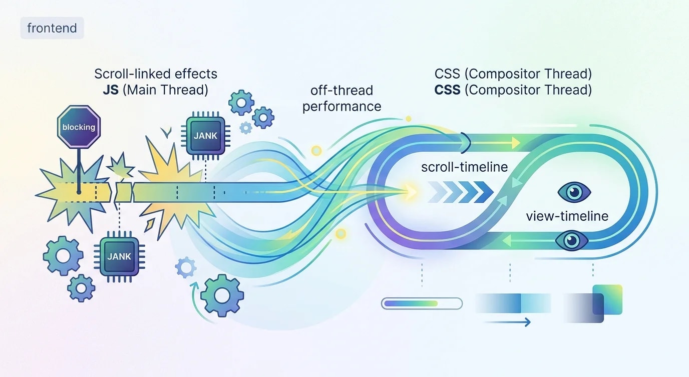
Every CSS property falls into one of three rendering categories: layout, paint, or composite. Only composite-layer animations consistently hit 60fps because they're the only ones the GPU handles entirely off the main thread.
The Rendering Pipeline and Why It Matters
When you animate width, the browser recalculates layout for every frame. When you animate background-color, it repaints pixels. When you animate transform or opacity, it composites existing layers—no layout or paint required.
/* ❌ Animating layout properties: triggers full pipeline */
.card-expand-bad {
  transition: width 300ms ease, height 300ms ease;
}

.card-expand-bad:hover {
  width: 400px;   /* Forces layout recalculation */
  height: 300px;  /* Every surrounding element shifts */
}/* ✅ Animating composite properties: GPU-only pipeline */
.card-expand-good {
transition: transform 300ms ease;
will-change: transform;
}
.card-expand-good:hover {
transform: scale(1.1); /* GPU handles this without layout */
}The visual result looks similar, but the performance characteristics are radically different. The transform version runs on the GPU compositor thread, completely independent of JavaScript execution on the main thread. Even if your JavaScript is busy processing data, the animation stays smooth.
Promoting Elements to Compositor Layers
For GPU acceleration to work, the browser must promote the animated element to its own compositor layer. This happens automatically for transform and opacity animations, but you can hint at it for elements that will animate soon.
/* ❌ Overusing will-change: wastes GPU memory */
* {
  will-change: transform;  /* Every element gets its own layer! */
}

/* ❌ Static will-change on non-animated elements */
.static-content {
  will-change: transform;  /* Wastes resources */
}/* ✅ Targeted will-change only when animation is imminent */
.menu-item {
transition: transform 200ms ease, opacity 200ms ease;
}
.menu-item:hover {
will-change: transform, opacity;
}
.menu-item:active {
transform: scale(0.95);
opacity: 0.8;
}
/* ✅ Remove will-change after animation completes */
.modal {
opacity: 0;
transform: translateY(20px);
transition: transform 300ms ease, opacity 300ms ease;
}
.modal.visible {
opacity: 1;
transform: translateY(0);
will-change: transform, opacity;
}// Programmatic will-change management
function prepareAnimation(element) {
element.style.willChange = "transform, opacity";
element.addEventListener(
"transitionend",
() => {
element.style.willChange = "auto";
},
{ once: true }
);
}Each compositor layer consumes GPU memory. On a mobile device with limited VRAM, promoting too many elements causes the GPU to start evicting layers—which makes performance worse, not better.
Replacing Layout Animations With Transform Equivalents
Most layout-triggering animations have transform-based equivalents that look identical but perform dramatically better.
/* ❌ Animating top/left: triggers layout every frame */
.tooltip-bad {
  position: absolute;
  top: 0;
  left: 0;
  transition: top 300ms, left 300ms;
}

.tooltip-bad.active {
  top: 100px;
  left: 200px;
}

/* ✅ Animating transform: composited, no layout */
.tooltip-good {
  position: absolute;
  top: 0;
  left: 0;
  transition: transform 300ms ease;
}

.tooltip-good.active {
  transform: translate(200px, 100px);
}/* Common replacements for layout properties */
/* width/height animation → scale transform */
.expand {
transform: scale(1);
transition: transform 200ms;
}
.expand.active {
transform: scale(1.5);
}
/* margin animation → translate transform */
.slide {
transform: translateX(0);
transition: transform 300ms;
}
.slide.active {
transform: translateX(100px);
}
/* border-radius animation → clip-path (paint only) */
.morph {
clip-path: circle(50%);
transition: clip-path 400ms ease;
}
.morph.active {
clip-path: circle(100%);
}The transform property is the workhorse of performant animations. translate replaces position changes, scale replaces size changes, and rotate handles rotations—all without touching layout.
JavaScript Animation With requestAnimationFrame
When CSS transitions aren't enough—complex choreography, physics-based motion, canvas animations—JavaScript takes over. The key is synchronizing with the browser's refresh cycle.
// ❌ setTimeout-based animation: inconsistent frame timing
function animateBad(element, targetX) {
  let currentX = 0;
  function step() {
    currentX += 2;
    element.style.transform = `translateX(${currentX}px)`;
    if (currentX < targetX) {
      setTimeout(step, 16); // Not synced to display refresh
    }
  }
  step();
}// ✅ requestAnimationFrame with delta time
function animateGood(element, targetX, duration = 300) {
const startTime = performance.now();
const startX = 0;
function frame(currentTime) {
const elapsed = currentTime - startTime;
const progress = Math.min(elapsed / duration, 1);
// Ease-out cubic for natural deceleration
const eased = 1 - Math.pow(1 - progress, 3);
const currentX = startX + (targetX - startX) * eased;
element.style.transform = `translateX(${currentX}px)`;
if (progress < 1) {
requestAnimationFrame(frame);
}
}
requestAnimationFrame(frame);
}// ✅ Spring physics for natural-feeling animations
function springAnimation(element, target, config = {}) {
const {
stiffness = 170,
damping = 26,
mass = 1,
precision = 0.01,
} = config;
let position = 0;
let velocity = 0;
function step(timestamp) {
const dt = 1 / 60; // Fixed timestep for deterministic physics
const springForce = -stiffness * (position - target);
const dampingForce = -damping * velocity;
const acceleration = (springForce + dampingForce) / mass;
velocity += acceleration * dt;
position += velocity * dt;
element.style.transform = `translateX(${position}px)`;
// Stop when close enough and barely moving
const isSettled =
Math.abs(position - target) < precision &&
Math.abs(velocity) < precision;
if (!isSettled) {
requestAnimationFrame(step);
}
}
requestAnimationFrame(step);
}Spring physics produces animations that feel physical because they are physical—the motion follows real spring dynamics. No easing curve can replicate the interruptible, responsive feel of spring animations.
Avoiding Layout Thrashing in Animations
Layout thrashing happens when you read and write DOM properties alternately, forcing the browser to recalculate layout multiple times per frame.
// ❌ Layout thrashing: read-write-read-write pattern
function animateListBad(items) {
  items.forEach((item) => {
    const height = item.offsetHeight;     // Read (forces layout)
    item.style.height = height * 2 + "px"; // Write (invalidates layout)
    // Next iteration's read triggers another layout!
  });
}// ✅ Batch reads then batch writes
function animateListGood(items) {
// Phase 1: Read all measurements
const heights = items.map((item) => item.offsetHeight);
// Phase 2: Write all changes (single layout recalculation)
items.forEach((item, i) => {
item.style.transform = `scaleY(${heights[i] * 2 / heights[i]})`;
});
}
// ✅ Using the Web Animations API for batched animations
function animateListModern(items) {
items.forEach((item, index) => {
item.animate(
[
{ transform: "translateY(0)", opacity: 1 },
{ transform: "translateY(-20px)", opacity: 0 },
],
{
duration: 300,
delay: index * 50, // Stagger effect
easing: "ease-out",
fill: "forwards",
}
);
});
}The Web Animations API (WAAPI) is the modern solution for complex JavaScript animations. It runs on the compositor thread like CSS animations but with the flexibility of JavaScript. Browser support is excellent, and it handles batching internally.
Measuring Animation Performance
You can't improve what you don't measure. Chrome DevTools provides frame-by-frame performance analysis for animations.
// Runtime animation performance monitoring
class AnimationMonitor {
  constructor() {
    this.frames = [];
    this.running = false;
  }

  start() {
    this.running = true;
    this.frames = [];
    this.lastTimestamp = performance.now();
    this.measure(this.lastTimestamp);
  }

  measure(timestamp) {
    if (!this.running) return;

    const delta = timestamp - this.lastTimestamp;
    this.frames.push(delta);
    this.lastTimestamp = timestamp;

    requestAnimationFrame((ts) => this.measure(ts));
  }

  stop() {
    this.running = false;
    return this.getReport();
  }

  getReport() {
    const sorted = [...this.frames].sort((a, b) => a - b);
    const p50 = sorted[Math.floor(sorted.length * 0.5)];
    const p95 = sorted[Math.floor(sorted.length * 0.95)];
    const p99 = sorted[Math.floor(sorted.length * 0.99)];
    const jankFrames = this.frames.filter((d) => d > 16.67).length;

    return {
      totalFrames: this.frames.length,
      droppedFrames: jankFrames,
      jankPercentage: ((jankFrames / this.frames.length) * 100).toFixed(1),
      p50FrameTime: p50.toFixed(2),
      p95FrameTime: p95.toFixed(2),
      p99FrameTime: p99.toFixed(2),
    };
  }
}
A healthy animation report shows less than 5% janked frames and p95 frame times under 16.67ms (the budget for 60fps). If your p95 exceeds this, users on mid-range devices will see visible stuttering.
Key Takeaways
Smooth animations come from respecting the browser's rendering pipeline, not fighting it. Animate transform and opacity whenever possible—they're the only properties that skip layout and paint entirely. Use will-change sparingly and only when animation is imminent. Batch DOM reads and writes to prevent layout thrashing. And most importantly, measure on real devices—your development machine's performance is not representative of your users' experience.
The Web Animations API is the future of complex web animations, combining compositor-thread performance with JavaScript-level control. For physics-based motion, spring animations deliver a feel that no predefined easing curve can match. The goal isn't to avoid animation—it's to animate the right properties at the right layer of the rendering pipeline.