Scroll-Driven CSS Animations Without JavaScript
A hands-on guide to performant scroll-driven animations with native CSS scroll timelines, view transitions and the animation-timeline property.

The End of JavaScript-Driven Scroll Animations
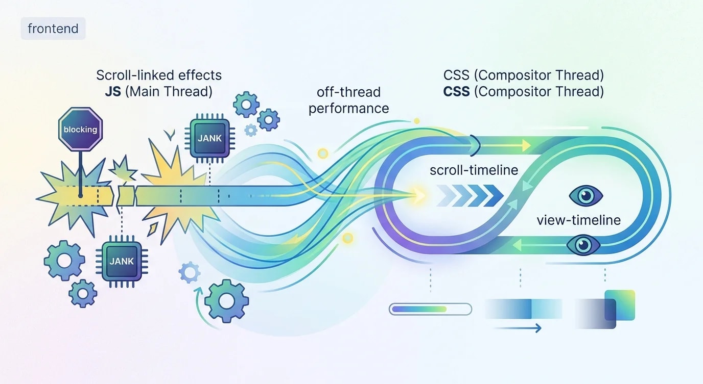
For a decade, scroll animations required JavaScript. You listened for scroll events, calculated positions, and updated styles imperatively. Libraries like GSAP ScrollTrigger, Framer Motion, and Intersection Observer made it manageable, but the fundamental approach—JavaScript hijacking the main thread to drive visual effects—was always a performance compromise.
CSS Scroll-Driven Animations change this entirely. The animation-timeline property connects CSS animations directly to scroll progress. The browser handles the calculations on the compositor thread, delivering 60fps scroll effects without a single line of JavaScript. This is not a polyfill or a hack—it is a W3C specification with growing browser support.
Scroll Progress Animations: The Basics
A scroll-linked animation maps an element's animation progress to the scroll position of a container. Instead of running over time (seconds), the animation runs over space (scroll distance).
/* ❌ Old approach: JavaScript scroll listener */
/*
  window.addEventListener('scroll', () => {
    const progress = window.scrollY / document.body.scrollHeight;
    element.style.transform = `scaleX(${progress})`;
  });
  // Runs on main thread, causes jank, needs throttling
*//* ✅ New approach: Pure CSS scroll animation */
.progress-bar {
position: fixed;
top: 0;
left: 0;
width: 100%;
height: 4px;
background: linear-gradient(90deg, #3b82f6, #8b5cf6);
transform-origin: left;
animation: grow-progress linear both;
animation-timeline: scroll();
}
@keyframes grow-progress {
from {
transform: scaleX(0);
}
to {
transform: scaleX(1);
}
}The animation-timeline: scroll() declaration replaces time-based progression with scroll-based progression. The both fill mode ensures the animation state persists at both extremes. No JavaScript, no scroll listener, no jank.
Named Scroll Timelines for Nested Containers
The scroll() function defaults to the nearest scrollable ancestor. For more control, named scroll timelines let you link animations to specific scrollable elements.
.scroll-container {
  overflow-y: auto;
  height: 600px;
  scroll-timeline-name: --container-scroll;
  scroll-timeline-axis: block;
}

.parallax-background {
  animation: parallax-shift linear both;
  animation-timeline: --container-scroll;
}

@keyframes parallax-shift {
  from {
    transform: translateY(0);
  }
  to {
    transform: translateY(-200px);
  }
}

.fade-header {
  animation: header-fade linear both;
  animation-timeline: --container-scroll;
  animation-range: 0% 30%;
}

@keyframes header-fade {
  from {
    opacity: 1;
    transform: translateY(0);
  }
  to {
    opacity: 0;
    transform: translateY(-40px);
  }
}
The animation-range property is powerful. It limits when the animation runs within the scroll timeline. animation-range: 0% 30% means the animation completes by the time the user has scrolled 30% of the container. This creates staggered effects where different elements animate at different scroll positions.
View Timelines: Animating Elements as They Enter
View timelines trigger animations based on an element's visibility within its scrollable ancestor. This replaces the Intersection Observer pattern for entrance animations.
/* ❌ Old: Intersection Observer + class toggling */
/*
  const observer = new IntersectionObserver((entries) => {
    entries.forEach(entry => {
      if (entry.isIntersecting) {
        entry.target.classList.add('visible');
      }
    });
  });
  document.querySelectorAll('.animate-on-scroll').forEach(el => {
    observer.observe(el);
  });
*//* ✅ New: Pure CSS view timeline */
.card {
animation: slide-up linear both;
animation-timeline: view();
animation-range: entry 0% entry 100%;
}
@keyframes slide-up {
from {
opacity: 0;
transform: translateY(80px);
}
to {
opacity: 1;
transform: translateY(0);
}
}The view() function creates a timeline based on the element's intersection with its viewport. animation-range: entry 0% entry 100% means the animation runs from when the element first enters the viewport to when it is fully visible.
View timeline ranges have named phases:
.staggered-reveal {
  animation: reveal linear both;
  animation-timeline: view();
}

/* Entry: element entering the viewport from below */
.entry-animation {
  animation-range: entry 0% entry 100%;
}

/* Cover: element covering the viewport (full visibility) */
.cover-animation {
  animation-range: cover 0% cover 100%;
}

/* Exit: element leaving the viewport from above */
.exit-animation {
  animation-range: exit 0% exit 100%;
}

/* Contain: element fully contained within viewport */
.contain-animation {
  animation-range: contain 0% contain 100%;
}

@keyframes reveal {
  from {
    opacity: 0;
    transform: translateY(60px) scale(0.95);
    filter: blur(4px);
  }
  to {
    opacity: 1;
    transform: translateY(0) scale(1);
    filter: blur(0);
  }
}
Building a Scroll-Driven Hero Section
Combining multiple scroll-driven animations creates rich, performant hero sections without any JavaScript.
<section class="hero">
  <div class="hero-background"></div>
  <h1 class="hero-title">Build Better Software</h1>
  <p class="hero-subtitle">Engineering excellence at every layer</p>
  <div class="scroll-indicator">
    <span class="scroll-arrow"></span>
  </div>
</section>

<section class="content">
  <article class="feature-card">Feature One</article>
  <article class="feature-card">Feature Two</article>
  <article class="feature-card">Feature Three</article>
</section>.hero {
position: relative;
height: 100vh;
display: grid;
place-items: center;
overflow: hidden;
}
.hero-background {
position: absolute;
inset: 0;
background: linear-gradient(135deg, #0f172a 0%, #1e293b 100%);
animation: bg-parallax linear both;
animation-timeline: scroll();
animation-range: 0vh 100vh;
}
@keyframes bg-parallax {
to {
transform: scale(1.2) translateY(-10%);
filter: brightness(0.4);
}
}
.hero-title {
font-size: clamp(2rem, 6vw, 5rem);
color: white;
animation: title-exit linear both;
animation-timeline: scroll();
animation-range: 0vh 60vh;
}
@keyframes title-exit {
to {
opacity: 0;
transform: translateY(-100px) scale(0.8);
filter: blur(8px);
}
}
.hero-subtitle {
color: rgba(255, 255, 255, 0.7);
animation: subtitle-exit linear both;
animation-timeline: scroll();
animation-range: 0vh 40vh;
}
@keyframes subtitle-exit {
to {
opacity: 0;
transform: translateY(-60px);
}
}
.scroll-indicator {
position: absolute;
bottom: 2rem;
animation: fade-indicator linear both;
animation-timeline: scroll();
animation-range: 0vh 20vh;
}
@keyframes fade-indicator {
to {
opacity: 0;
}
}
/* Feature cards enter with staggered view animations */
.feature-card {
animation: card-enter linear both;
animation-timeline: view();
animation-range: entry 0% entry 80%;
}
.feature-card:nth-child(2) {
animation-delay: 0.1s; /* Stagger effect */
}
.feature-card:nth-child(3) {
animation-delay: 0.2s;
}
@keyframes card-enter {
from {
opacity: 0;
transform: translateY(60px) rotateX(10deg);
}
to {
opacity: 1;
transform: translateY(0) rotateX(0deg);
}
}The hero text fades out at different rates as you scroll, creating a depth parallax effect. The background zooms and dims. Feature cards animate in as they enter the viewport. All of this runs on the compositor thread.
Combining with View Transitions API
The View Transitions API complements scroll-driven animations by providing smooth transitions between page states or navigations.
/* Opt-in to view transitions */
@view-transition {
  navigation: auto;
}

/* Style the transition pseudo-elements */
::view-transition-old(root) {
  animation: fade-out 0.3s ease-out;
}

::view-transition-new(root) {
  animation: fade-in 0.3s ease-in;
}

/* Named transitions for specific elements */
.product-image {
  view-transition-name: product-hero;
}

::view-transition-old(product-hero) {
  animation: scale-down 0.4s cubic-bezier(0.4, 0, 0.2, 1);
}

::view-transition-new(product-hero) {
  animation: scale-up 0.4s cubic-bezier(0.4, 0, 0.2, 1);
}

@keyframes scale-down {
  to {
    transform: scale(0.8);
    opacity: 0;
  }
}

@keyframes scale-up {
  from {
    transform: scale(1.2);
    opacity: 0;
  }
}

@keyframes fade-out {
  to {
    opacity: 0;
  }
}

@keyframes fade-in {
  from {
    opacity: 0;
  }
}
Progressive Enhancement and Fallbacks
Not all browsers support scroll-driven animations yet. Use @supports queries to add them as progressive enhancement over a base experience that works everywhere.
/* Base experience — works in all browsers */
.card {
  opacity: 1;
  transform: none;
  transition: opacity 0.3s, transform 0.3s;
}

/* Enhanced experience — scroll-driven animation */
@supports (animation-timeline: scroll()) {
  .card {
    animation: card-reveal linear both;
    animation-timeline: view();
    animation-range: entry 10% entry 90%;
  }

  @keyframes card-reveal {
    from {
      opacity: 0;
      transform: translateY(40px);
    }
    to {
      opacity: 1;
      transform: translateY(0);
    }
  }
}

/* Respect motion preferences */
@media (prefers-reduced-motion: reduce) {
  .card {
    animation: none !important;
    opacity: 1;
    transform: none;
  }
}
The prefers-reduced-motion media query is non-negotiable. Scroll-driven animations can trigger motion sickness in users with vestibular disorders. Always provide a reduced-motion alternative that removes or minimizes animation.
Key Takeaways
CSS Scroll-Driven Animations eliminate the biggest friction point in web animation: the JavaScript dependency. Scroll progress timelines, view timelines, and animation ranges give you precise control over when and how elements animate relative to scroll position—all running on the compositor thread at 60fps.
The mental model shift is significant. Instead of "listen for scroll events and calculate positions," you define keyframes and declare which scroll context drives them. The browser handles the synchronization.
Progressive enhancement is the deployment strategy. Write a baseline experience that works without scroll animations, layer them in with @supports, and always honor prefers-reduced-motion. The users who get the enhanced experience see buttery smooth interactions. The users who do not still see a functional page. That is how the web should work.