Scroll-gesteuerte CSS-Animationen ohne JavaScript
Praxisleitfaden für performante scroll-gesteuerte Animationen mit nativen CSS-Scroll-Timelines, View Transitions und der Eigenschaft animation-timeline.

Das Ende der JavaScript-gesteuerten Scroll-Animationen
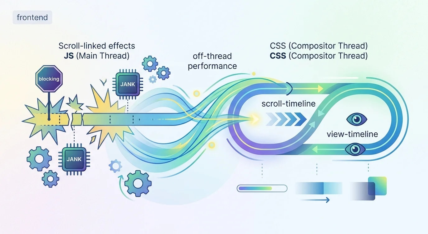
Ein Jahrzehnt lang erforderten Scroll-Animationen JavaScript. Man lauschte auf Scroll-Events, berechnete Positionen und aktualisierte Styles imperativ. Bibliotheken wie GSAP ScrollTrigger, Framer Motion und Intersection Observer machten das handhabbar, aber der grundlegende Ansatz — JavaScript, das den Main Thread kapert, um visuelle Effekte anzutreiben — war immer ein Performance-Kompromiss.
Scroll-gesteuerte CSS-Animationen ändern das vollständig. Die Eigenschaft animation-timeline verbindet CSS-Animationen direkt mit dem Scroll-Fortschritt. Der Browser übernimmt die Berechnungen auf dem Compositor-Thread und liefert Scroll-Effekte mit 60 fps ohne eine einzige Zeile JavaScript. Das ist kein Polyfill und kein Hack — es ist eine W3C-Spezifikation mit wachsender Browserunterstützung.
Scroll-Fortschrittsanimationen: Die Grundlagen
Eine scroll-gekoppelte Animation bildet den Animationsfortschritt eines Elements auf die Scroll-Position eines Containers ab. Statt über die Zeit (Sekunden) läuft die Animation über den Raum (Scroll-Distanz).
/* ❌ Old approach: JavaScript scroll listener */
/*
  window.addEventListener('scroll', () => {
    const progress = window.scrollY / document.body.scrollHeight;
    element.style.transform = `scaleX(${progress})`;
  });
  // Runs on main thread, causes jank, needs throttling
*//* ✅ New approach: Pure CSS scroll animation */
.progress-bar {
position: fixed;
top: 0;
left: 0;
width: 100%;
height: 4px;
background: linear-gradient(90deg, #3b82f6, #8b5cf6);
transform-origin: left;
animation: grow-progress linear both;
animation-timeline: scroll();
}
@keyframes grow-progress {
from {
transform: scaleX(0);
}
to {
transform: scaleX(1);
}
}Die Deklaration animation-timeline: scroll() ersetzt den zeitbasierten Fortschritt durch einen scrollbasierten. Der Fill-Modus both sorgt dafür, dass der Animationszustand an beiden Enden erhalten bleibt. Kein JavaScript, kein Scroll-Listener, kein Ruckeln.
Benannte Scroll-Timelines für verschachtelte Container
Die Funktion scroll() verwendet standardmäßig den nächsten scrollbaren Vorfahren. Für mehr Kontrolle erlauben benannte Scroll-Timelines, Animationen an bestimmte scrollbare Elemente zu binden.
.scroll-container {
  overflow-y: auto;
  height: 600px;
  scroll-timeline-name: --container-scroll;
  scroll-timeline-axis: block;
}

.parallax-background {
  animation: parallax-shift linear both;
  animation-timeline: --container-scroll;
}

@keyframes parallax-shift {
  from {
    transform: translateY(0);
  }
  to {
    transform: translateY(-200px);
  }
}

.fade-header {
  animation: header-fade linear both;
  animation-timeline: --container-scroll;
  animation-range: 0% 30%;
}

@keyframes header-fade {
  from {
    opacity: 1;
    transform: translateY(0);
  }
  to {
    opacity: 0;
    transform: translateY(-40px);
  }
}
Die Eigenschaft animation-range ist mächtig. Sie begrenzt, wann die Animation innerhalb der Scroll-Timeline läuft. animation-range: 0% 30% bedeutet, dass die Animation abgeschlossen ist, sobald der Nutzer 30 % des Containers gescrollt hat. So entstehen gestaffelte Effekte, bei denen verschiedene Elemente an unterschiedlichen Scroll-Positionen animiert werden.
View-Timelines: Elemente beim Eintreten animieren
View-Timelines lösen Animationen basierend auf der Sichtbarkeit eines Elements innerhalb seines scrollbaren Vorfahren aus. Das ersetzt das Intersection-Observer-Muster für Eingangsanimationen.
/* ❌ Old: Intersection Observer + class toggling */
/*
  const observer = new IntersectionObserver((entries) => {
    entries.forEach(entry => {
      if (entry.isIntersecting) {
        entry.target.classList.add('visible');
      }
    });
  });
  document.querySelectorAll('.animate-on-scroll').forEach(el => {
    observer.observe(el);
  });
*//* ✅ New: Pure CSS view timeline */
.card {
animation: slide-up linear both;
animation-timeline: view();
animation-range: entry 0% entry 100%;
}
@keyframes slide-up {
from {
opacity: 0;
transform: translateY(80px);
}
to {
opacity: 1;
transform: translateY(0);
}
}Die Funktion view() erzeugt eine Timeline basierend auf der Überschneidung des Elements mit seinem Viewport. animation-range: entry 0% entry 100% bedeutet, dass die Animation läuft, von dem Moment, in dem das Element erstmals in den Viewport eintritt, bis es vollständig sichtbar ist.
View-Timeline-Ranges haben benannte Phasen:
.staggered-reveal {
  animation: reveal linear both;
  animation-timeline: view();
}

/* Entry: element entering the viewport from below */
.entry-animation {
  animation-range: entry 0% entry 100%;
}

/* Cover: element covering the viewport (full visibility) */
.cover-animation {
  animation-range: cover 0% cover 100%;
}

/* Exit: element leaving the viewport from above */
.exit-animation {
  animation-range: exit 0% exit 100%;
}

/* Contain: element fully contained within viewport */
.contain-animation {
  animation-range: contain 0% contain 100%;
}

@keyframes reveal {
  from {
    opacity: 0;
    transform: translateY(60px) scale(0.95);
    filter: blur(4px);
  }
  to {
    opacity: 1;
    transform: translateY(0) scale(1);
    filter: blur(0);
  }
}
Eine scroll-gesteuerte Hero-Section bauen
Die Kombination mehrerer scroll-gesteuerter Animationen ergibt reichhaltige, performante Hero-Sections ohne jegliches JavaScript.
<section class="hero">
  <div class="hero-background"></div>
  <h1 class="hero-title">Build Better Software</h1>
  <p class="hero-subtitle">Engineering excellence at every layer</p>
  <div class="scroll-indicator">
    <span class="scroll-arrow"></span>
  </div>
</section>

<section class="content">
  <article class="feature-card">Feature One</article>
  <article class="feature-card">Feature Two</article>
  <article class="feature-card">Feature Three</article>
</section>.hero {
position: relative;
height: 100vh;
display: grid;
place-items: center;
overflow: hidden;
}
.hero-background {
position: absolute;
inset: 0;
background: linear-gradient(135deg, #0f172a 0%, #1e293b 100%);
animation: bg-parallax linear both;
animation-timeline: scroll();
animation-range: 0vh 100vh;
}
@keyframes bg-parallax {
to {
transform: scale(1.2) translateY(-10%);
filter: brightness(0.4);
}
}
.hero-title {
font-size: clamp(2rem, 6vw, 5rem);
color: white;
animation: title-exit linear both;
animation-timeline: scroll();
animation-range: 0vh 60vh;
}
@keyframes title-exit {
to {
opacity: 0;
transform: translateY(-100px) scale(0.8);
filter: blur(8px);
}
}
.hero-subtitle {
color: rgba(255, 255, 255, 0.7);
animation: subtitle-exit linear both;
animation-timeline: scroll();
animation-range: 0vh 40vh;
}
@keyframes subtitle-exit {
to {
opacity: 0;
transform: translateY(-60px);
}
}
.scroll-indicator {
position: absolute;
bottom: 2rem;
animation: fade-indicator linear both;
animation-timeline: scroll();
animation-range: 0vh 20vh;
}
@keyframes fade-indicator {
to {
opacity: 0;
}
}
/* Feature cards enter with staggered view animations */
.feature-card {
animation: card-enter linear both;
animation-timeline: view();
animation-range: entry 0% entry 80%;
}
.feature-card:nth-child(2) {
animation-delay: 0.1s; /* Stagger effect */
}
.feature-card:nth-child(3) {
animation-delay: 0.2s;
}
@keyframes card-enter {
from {
opacity: 0;
transform: translateY(60px) rotateX(10deg);
}
to {
opacity: 1;
transform: translateY(0) rotateX(0deg);
}
}Der Hero-Text blendet beim Scrollen mit unterschiedlichen Geschwindigkeiten aus und erzeugt so einen Tiefen-Parallax-Effekt. Der Hintergrund zoomt und dunkelt ab. Feature-Karten animieren sich, sobald sie in den Viewport eintreten. All das läuft auf dem Compositor-Thread.
Kombination mit der View Transitions API
Die View Transitions API ergänzt scroll-gesteuerte Animationen, indem sie weiche Übergänge zwischen Seitenzuständen oder Navigationen bereitstellt.
/* Opt-in to view transitions */
@view-transition {
  navigation: auto;
}

/* Style the transition pseudo-elements */
::view-transition-old(root) {
  animation: fade-out 0.3s ease-out;
}

::view-transition-new(root) {
  animation: fade-in 0.3s ease-in;
}

/* Named transitions for specific elements */
.product-image {
  view-transition-name: product-hero;
}

::view-transition-old(product-hero) {
  animation: scale-down 0.4s cubic-bezier(0.4, 0, 0.2, 1);
}

::view-transition-new(product-hero) {
  animation: scale-up 0.4s cubic-bezier(0.4, 0, 0.2, 1);
}

@keyframes scale-down {
  to {
    transform: scale(0.8);
    opacity: 0;
  }
}

@keyframes scale-up {
  from {
    transform: scale(1.2);
    opacity: 0;
  }
}

@keyframes fade-out {
  to {
    opacity: 0;
  }
}

@keyframes fade-in {
  from {
    opacity: 0;
  }
}
Progressive Enhancement und Fallbacks
Noch unterstützen nicht alle Browser scroll-gesteuerte Animationen. Mit @supports-Abfragen lassen sie sich als Progressive Enhancement über ein Grundgerüst legen, das überall funktioniert.
/* Base experience — works in all browsers */
.card {
  opacity: 1;
  transform: none;
  transition: opacity 0.3s, transform 0.3s;
}

/* Enhanced experience — scroll-driven animation */
@supports (animation-timeline: scroll()) {
  .card {
    animation: card-reveal linear both;
    animation-timeline: view();
    animation-range: entry 10% entry 90%;
  }

  @keyframes card-reveal {
    from {
      opacity: 0;
      transform: translateY(40px);
    }
    to {
      opacity: 1;
      transform: translateY(0);
    }
  }
}

/* Respect motion preferences */
@media (prefers-reduced-motion: reduce) {
  .card {
    animation: none !important;
    opacity: 1;
    transform: none;
  }
}
Die Media Query prefers-reduced-motion ist nicht verhandelbar. Scroll-gesteuerte Animationen können bei Nutzern mit vestibulären Störungen Übelkeit auslösen. Biete immer eine Reduced-Motion-Alternative an, die Animationen entfernt oder minimiert.
Die wichtigsten Erkenntnisse
Scroll-gesteuerte CSS-Animationen beseitigen den größten Reibungspunkt der Web-Animation: die JavaScript-Abhängigkeit. Scroll-Fortschritts-Timelines, View-Timelines und Animation-Ranges geben dir präzise Kontrolle darüber, wann und wie Elemente relativ zur Scroll-Position animiert werden — alles auf dem Compositor-Thread mit 60 fps.
Der Wechsel des mentalen Modells ist erheblich. Statt „auf Scroll-Events lauschen und Positionen berechnen" definierst du Keyframes und deklarierst, welcher Scroll-Kontext sie antreibt. Der Browser übernimmt die Synchronisation.
Progressive Enhancement ist die Deployment-Strategie. Schreibe ein Basiserlebnis, das ohne Scroll-Animationen funktioniert, lege sie mit @supports darüber und respektiere immer prefers-reduced-motion. Die Nutzer mit dem erweiterten Erlebnis sehen butterweiche Interaktionen. Die anderen sehen weiterhin eine funktionierende Seite. So sollte das Web funktionieren.