CSS Scroll-Driven Animations: Jenseits von Scroll-Handlern
Baue performante scroll-gekoppelte Animationen mit der CSS-API: Scroll- und View-Timelines, Parallax und Sticky-Header, abseits des Main Threads.
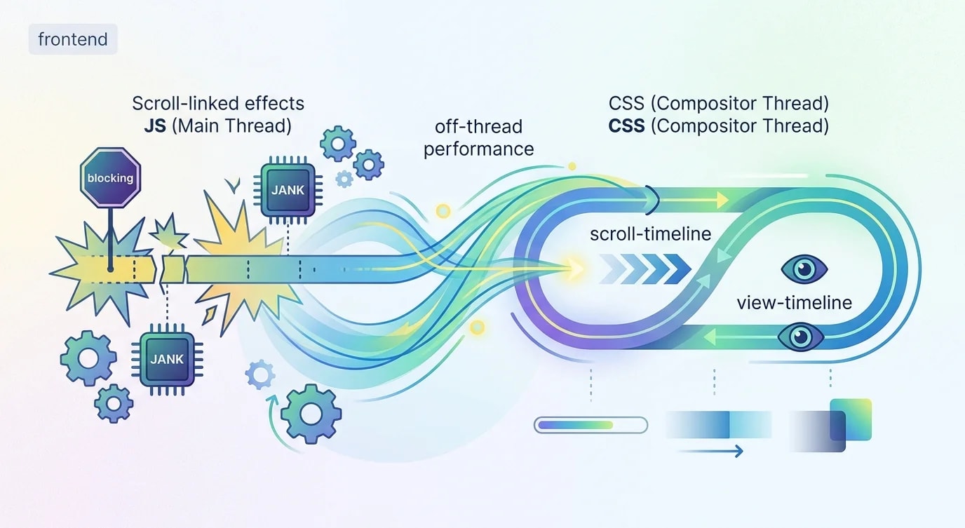
Scrollgesteuerte Animationen erforderten traditionell JavaScript – IntersectionObserver, Scroll-Event-Listener oder Animationsbibliotheken wie GSAPs ScrollTrigger. Das funktioniert, läuft aber auf dem Main Thread und konkurriert mit deiner Anwendungslogik um CPU-Zeit. Jedes Scroll-Event, das einen JavaScript-Callback auslöst, birgt das Risiko von Rucklern.
CSS Scroll-Driven Animations verlagern diese Arbeit vollständig vom Main Thread. Der Browser-Compositor übernimmt die Animationen und erzeugt flüssige 60-fps-Scroll-Effekte ohne eine einzige Zeile JavaScript. Die API nutzt zwei Timeline-Typen: scroll() für den Scroll-Fortschritt des Dokuments und view() für die Sichtbarkeit eines Elements im Viewport.
Scroll-Fortschritts-Timeline
Eine Scroll-Fortschritts-Timeline bildet die Scroll-Position eines Containers auf den Animationsfortschritt ab. Während der Nutzer von oben nach unten scrollt, läuft die Animation von 0 % bis 100 %.
/* ❌ JavaScript scroll handler — runs on main thread */
/*
window.addEventListener('scroll', () => {
  const progress = window.scrollY /
    (document.body.scrollHeight - window.innerHeight);
  progressBar.style.width = `${progress * 100}%`;
});
// Fires 60+ times per second, blocks main thread
*//* ✅ CSS scroll progress — off main thread */
.progress-bar {
position: fixed;
top: 0;
left: 0;
height: 4px;
background: linear-gradient(
to right,
#3b82f6,
#8b5cf6
);
transform-origin: left;
width: 100%;
/* Define the animation */
animation: scaleProgress linear;
/* Link to scroll position */
animation-timeline: scroll();
}
@keyframes scaleProgress {
from {
transform: scaleX(0);
}
to {
transform: scaleX(1);
}
}Die Funktion scroll() erzeugt eine Timeline, die mit dem nächsten scrollbaren Vorfahrenelement verknüpft ist. Standardmäßig verfolgt sie die Block-Achse (vertikal). Die Animation läuft synchron zum Scrollen – kein JavaScript, kein Ruckeln.
View-Timeline: Animationen zur Elementsichtbarkeit
Die view()-Timeline löst Animationen aus, je nachdem, wann ein Element in den Viewport ein- und aus ihm austritt. Damit ersetzt sie IntersectionObserver als Animations-Trigger.
/* ❌ IntersectionObserver approach */
/*
const observer = new IntersectionObserver(
  (entries) => {
    entries.forEach((entry) => {
      if (entry.isIntersecting) {
        entry.target.classList.add('visible');
      }
    });
  },
  { threshold: 0.2 }
);
document.querySelectorAll('.fade-in')
  .forEach((el) => observer.observe(el));
*//* ✅ CSS view timeline — declarative, off-thread */
.fade-in {
animation: fadeSlideIn linear both;
animation-timeline: view();
animation-range: entry 0% entry 100%;
}
@keyframes fadeSlideIn {
from {
opacity: 0;
transform: translateY(40px);
}
to {
opacity: 1;
transform: translateY(0);
}
}
/* Staggered entrance for card grids */
.card {
animation: cardEntrance ease-out both;
animation-timeline: view();
animation-range: entry 10% entry 80%;
}
.card:nth-child(2) {
animation-delay: 0.1s;
}
.card:nth-child(3) {
animation-delay: 0.2s;
}
@keyframes cardEntrance {
from {
opacity: 0;
transform: translateY(30px) scale(0.95);
}
to {
opacity: 1;
transform: translateY(0) scale(1);
}
}Animation Range: Trigger feinjustieren
Die Eigenschaft animation-range steuert exakt, wann innerhalb der Timeline die Animation abgespielt wird. Das ist der Schlüssel zu präzisen scrollgesteuerten Effekten.
/* Full range options:
   entry   — element entering the viewport
   exit    — element leaving the viewport
   contain — element fully contained in viewport
   cover   — from entry start to exit end
*/

/* Play animation only while element enters */
.enter-only {
  animation: reveal linear both;
  animation-timeline: view();
  animation-range: entry 0% entry 100%;
}

/* Play animation while element is fully visible */
.while-visible {
  animation: pulse linear both;
  animation-timeline: view();
  animation-range: contain 0% contain 100%;
}

/* Play across the entire visibility lifecycle */
.full-lifecycle {
  animation: fullCycle linear both;
  animation-timeline: view();
  animation-range: cover 0% cover 100%;
}

@keyframes reveal {
  from {
    opacity: 0;
    clip-path: inset(0 0 100% 0);
  }
  to {
    opacity: 1;
    clip-path: inset(0 0 0 0);
  }
}

@keyframes pulse {
  0%, 100% {
    transform: scale(1);
  }
  50% {
    transform: scale(1.02);
  }
}

@keyframes fullCycle {
  0% {
    opacity: 0;
    transform: translateX(-50px);
  }
  30% {
    opacity: 1;
    transform: translateX(0);
  }
  70% {
    opacity: 1;
    transform: translateX(0);
  }
  100% {
    opacity: 0;
    transform: translateX(50px);
  }
}
Parallax-Effekte ohne JavaScript
Parallax-Scrolling erfordert traditionell die Berechnung von Versatzpositionen in JavaScript. CSS-Scroll-Timelines machen es deklarativ.
.parallax-container {
  position: relative;
  overflow: hidden;
  height: 100vh;
}

.parallax-bg {
  position: absolute;
  inset: -20% 0;
  background: url("/hero-bg.webp") center/cover;

  animation: parallaxShift linear;
  animation-timeline: scroll(root);
}

@keyframes parallaxShift {
  from {
    transform: translateY(-10%);
  }
  to {
    transform: translateY(10%);
  }
}

/* Multi-layer parallax */
.layer-back {
  animation: parallaxSlow linear;
  animation-timeline: scroll(root);
}

.layer-mid {
  animation: parallaxMedium linear;
  animation-timeline: scroll(root);
}

.layer-front {
  animation: parallaxFast linear;
  animation-timeline: scroll(root);
}

@keyframes parallaxSlow {
  from { transform: translateY(0); }
  to { transform: translateY(-50px); }
}

@keyframes parallaxMedium {
  from { transform: translateY(0); }
  to { transform: translateY(-100px); }
}

@keyframes parallaxFast {
  from { transform: translateY(0); }
  to { transform: translateY(-200px); }
}
Sticky-Header-Transformationen
Header, die sich beim Scrollen verkleinern, den Hintergrund ändern oder einen Schatten einblenden – alles ohne JavaScript.
.header {
  position: sticky;
  top: 0;
  z-index: 100;

  /* Named scroll timeline on the root */
  animation: headerTransform linear;
  animation-timeline: scroll(root);
  animation-range: 0px 200px;
}

@keyframes headerTransform {
  from {
    padding-block: 1.5rem;
    background: transparent;
    box-shadow: none;
    backdrop-filter: none;
  }
  to {
    padding-block: 0.5rem;
    background: rgba(255, 255, 255, 0.9);
    box-shadow: 0 2px 8px rgba(0, 0, 0, 0.1);
    backdrop-filter: blur(12px);
  }
}

.header .logo {
  animation: logoShrink linear;
  animation-timeline: scroll(root);
  animation-range: 0px 200px;
}

@keyframes logoShrink {
  from {
    height: 48px;
  }
  to {
    height: 32px;
  }
}
Progressive Enhancement
Noch unterstützen nicht alle Browser scrollgesteuerte Animationen. Nutze @supports, um die erweiterte Erfahrung dort anzubieten, wo sie verfügbar ist, und andernfalls ein funktionales Fallback.
/* Base styles — works everywhere */
.fade-in {
  opacity: 1;
}

/* Enhanced experience where supported */
@supports (animation-timeline: view()) {
  .fade-in {
    opacity: 0;
    animation: fadeSlideIn linear both;
    animation-timeline: view();
    animation-range: entry 10% entry 90%;
  }

  @keyframes fadeSlideIn {
    from {
      opacity: 0;
      transform: translateY(30px);
    }
    to {
      opacity: 1;
      transform: translateY(0);
    }
  }
}

/* Respect reduced motion preferences */
@media (prefers-reduced-motion: reduce) {
  .fade-in {
    animation: none;
    opacity: 1;
    transform: none;
  }

  .progress-bar {
    animation: none;
    transform: scaleX(1);
  }

  .parallax-bg {
    animation: none;
    transform: none;
  }
}
Die wichtigsten Erkenntnisse
CSS Scroll-Driven Animations nutzen animation-timeline: scroll() und animation-timeline: view(), um Animationen mit der Scroll-Position bzw. der Elementsichtbarkeit zu verknüpfen – sie laufen vollständig auf dem Compositor-Thread des Browsers, ohne die JavaScript-Ausführung zu blockieren oder Scroll-Ruckler zu verursachen. Die Eigenschaft animation-range steuert exakt, wann Animationen innerhalb ihrer Timeline abgespielt werden, und zwar über benannte Bereiche wie entry, exit, contain und cover mit prozentualen Offsets – das gibt präzise Kontrolle über Triggerpunkte, für die früher komplexe IntersectionObserver-Schwellenwertberechnungen nötig waren. Parallax-Effekte, Sticky-Header-Transformationen und Fortschrittsanzeigen werden zu rein deklarativem CSS: Dieselben Effekte, für die früher Scroll-Event-Listener und requestAnimationFrame-Schleifen nötig waren, brauchen jetzt null JavaScript und sind performanter, weil sie den Main Thread vollständig umgehen. Nutze @supports (animation-timeline: view()) für Progressive Enhancement und füge immer @media (prefers-reduced-motion: reduce) ein, um Scroll-Animationen für Nutzer zu deaktivieren, die in ihren Systemeinstellungen eine Bewegungssensibilität angegeben haben.