CSS Scroll-Driven Animations: Beyond Scroll Handlers
Build performant scroll-linked animations with the CSS scroll-driven API: scroll and view timelines, parallax and sticky headers, off the main thread.
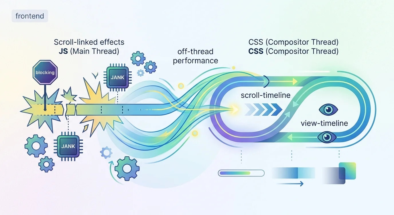
Scroll-driven animations have traditionally required JavaScript—IntersectionObserver, scroll event listeners, or animation libraries like GSAP's ScrollTrigger. These work but run on the main thread, competing with your application logic for CPU time. Every scroll event that triggers a JavaScript callback risks jank.
CSS scroll-driven animations move this work off the main thread entirely. The browser compositor handles the animations, producing smooth 60fps scroll effects without a single line of JavaScript. The API uses two timeline types: scroll() for document scroll progress and view() for element visibility within the viewport.
Scroll Progress Timeline
A scroll progress timeline maps the scroll position of a container to animation progress. As the user scrolls from top to bottom, the animation plays from 0% to 100%.
/* ❌ JavaScript scroll handler — runs on main thread */
/*
window.addEventListener('scroll', () => {
  const progress = window.scrollY /
    (document.body.scrollHeight - window.innerHeight);
  progressBar.style.width = `${progress * 100}%`;
});
// Fires 60+ times per second, blocks main thread
*//* ✅ CSS scroll progress — off main thread */
.progress-bar {
position: fixed;
top: 0;
left: 0;
height: 4px;
background: linear-gradient(
to right,
#3b82f6,
#8b5cf6
);
transform-origin: left;
width: 100%;
/* Define the animation */
animation: scaleProgress linear;
/* Link to scroll position */
animation-timeline: scroll();
}
@keyframes scaleProgress {
from {
transform: scaleX(0);
}
to {
transform: scaleX(1);
}
}The scroll() function creates a timeline linked to the nearest scrollable ancestor. By default, it tracks the block (vertical) scroll axis. The animation plays in sync with scrolling—no JavaScript, no jank.
View Timeline: Element Visibility Animations
The view() timeline triggers animations based on when an element enters and exits the viewport. This replaces IntersectionObserver for animation triggers.
/* ❌ IntersectionObserver approach */
/*
const observer = new IntersectionObserver(
  (entries) => {
    entries.forEach((entry) => {
      if (entry.isIntersecting) {
        entry.target.classList.add('visible');
      }
    });
  },
  { threshold: 0.2 }
);
document.querySelectorAll('.fade-in')
  .forEach((el) => observer.observe(el));
*//* ✅ CSS view timeline — declarative, off-thread */
.fade-in {
animation: fadeSlideIn linear both;
animation-timeline: view();
animation-range: entry 0% entry 100%;
}
@keyframes fadeSlideIn {
from {
opacity: 0;
transform: translateY(40px);
}
to {
opacity: 1;
transform: translateY(0);
}
}
/* Staggered entrance for card grids */
.card {
animation: cardEntrance ease-out both;
animation-timeline: view();
animation-range: entry 10% entry 80%;
}
.card:nth-child(2) {
animation-delay: 0.1s;
}
.card:nth-child(3) {
animation-delay: 0.2s;
}
@keyframes cardEntrance {
from {
opacity: 0;
transform: translateY(30px) scale(0.95);
}
to {
opacity: 1;
transform: translateY(0) scale(1);
}
}Animation Range: Fine-Tuning Triggers
The animation-range property controls exactly when within the timeline the animation plays. This is the key to precise scroll-driven effects.
/* Full range options:
   entry   — element entering the viewport
   exit    — element leaving the viewport
   contain — element fully contained in viewport
   cover   — from entry start to exit end
*/

/* Play animation only while element enters */
.enter-only {
  animation: reveal linear both;
  animation-timeline: view();
  animation-range: entry 0% entry 100%;
}

/* Play animation while element is fully visible */
.while-visible {
  animation: pulse linear both;
  animation-timeline: view();
  animation-range: contain 0% contain 100%;
}

/* Play across the entire visibility lifecycle */
.full-lifecycle {
  animation: fullCycle linear both;
  animation-timeline: view();
  animation-range: cover 0% cover 100%;
}

@keyframes reveal {
  from {
    opacity: 0;
    clip-path: inset(0 0 100% 0);
  }
  to {
    opacity: 1;
    clip-path: inset(0 0 0 0);
  }
}

@keyframes pulse {
  0%, 100% {
    transform: scale(1);
  }
  50% {
    transform: scale(1.02);
  }
}

@keyframes fullCycle {
  0% {
    opacity: 0;
    transform: translateX(-50px);
  }
  30% {
    opacity: 1;
    transform: translateX(0);
  }
  70% {
    opacity: 1;
    transform: translateX(0);
  }
  100% {
    opacity: 0;
    transform: translateX(50px);
  }
}
Parallax Effects Without JavaScript
Parallax scrolling traditionally requires calculating offset positions in JavaScript. CSS scroll timelines make it declarative.
.parallax-container {
  position: relative;
  overflow: hidden;
  height: 100vh;
}

.parallax-bg {
  position: absolute;
  inset: -20% 0;
  background: url("/hero-bg.webp") center/cover;

  animation: parallaxShift linear;
  animation-timeline: scroll(root);
}

@keyframes parallaxShift {
  from {
    transform: translateY(-10%);
  }
  to {
    transform: translateY(10%);
  }
}

/* Multi-layer parallax */
.layer-back {
  animation: parallaxSlow linear;
  animation-timeline: scroll(root);
}

.layer-mid {
  animation: parallaxMedium linear;
  animation-timeline: scroll(root);
}

.layer-front {
  animation: parallaxFast linear;
  animation-timeline: scroll(root);
}

@keyframes parallaxSlow {
  from { transform: translateY(0); }
  to { transform: translateY(-50px); }
}

@keyframes parallaxMedium {
  from { transform: translateY(0); }
  to { transform: translateY(-100px); }
}

@keyframes parallaxFast {
  from { transform: translateY(0); }
  to { transform: translateY(-200px); }
}
Sticky Header Transformations
Headers that shrink, change background, or reveal a shadow as you scroll—all without JavaScript.
.header {
  position: sticky;
  top: 0;
  z-index: 100;

  /* Named scroll timeline on the root */
  animation: headerTransform linear;
  animation-timeline: scroll(root);
  animation-range: 0px 200px;
}

@keyframes headerTransform {
  from {
    padding-block: 1.5rem;
    background: transparent;
    box-shadow: none;
    backdrop-filter: none;
  }
  to {
    padding-block: 0.5rem;
    background: rgba(255, 255, 255, 0.9);
    box-shadow: 0 2px 8px rgba(0, 0, 0, 0.1);
    backdrop-filter: blur(12px);
  }
}

.header .logo {
  animation: logoShrink linear;
  animation-timeline: scroll(root);
  animation-range: 0px 200px;
}

@keyframes logoShrink {
  from {
    height: 48px;
  }
  to {
    height: 32px;
  }
}
Progressive Enhancement
Not all browsers support scroll-driven animations yet. Use @supports to provide the enhanced experience where available and a functional fallback elsewhere.
/* Base styles — works everywhere */
.fade-in {
  opacity: 1;
}

/* Enhanced experience where supported */
@supports (animation-timeline: view()) {
  .fade-in {
    opacity: 0;
    animation: fadeSlideIn linear both;
    animation-timeline: view();
    animation-range: entry 10% entry 90%;
  }

  @keyframes fadeSlideIn {
    from {
      opacity: 0;
      transform: translateY(30px);
    }
    to {
      opacity: 1;
      transform: translateY(0);
    }
  }
}

/* Respect reduced motion preferences */
@media (prefers-reduced-motion: reduce) {
  .fade-in {
    animation: none;
    opacity: 1;
    transform: none;
  }

  .progress-bar {
    animation: none;
    transform: scaleX(1);
  }

  .parallax-bg {
    animation: none;
    transform: none;
  }
}
Key Takeaways
CSS scroll-driven animations use animation-timeline: scroll() and animation-timeline: view() to link animations to scroll position and element visibility respectively—running entirely on the browser's compositor thread without blocking JavaScript execution or causing scroll jank. The animation-range property controls exactly when animations play within their timeline using named ranges like entry, exit, contain, and cover with percentage offsets, giving precise control over trigger points that previously required complex IntersectionObserver threshold calculations. Parallax effects, sticky header transformations, and progress indicators become purely declarative CSS—the same effects that required scroll event listeners and requestAnimationFrame loops now need zero JavaScript and perform better because they bypass the main thread entirely. Use @supports (animation-timeline: view()) for progressive enhancement and always include @media (prefers-reduced-motion: reduce) to disable scroll animations for users who've indicated motion sensitivity in their system settings.