Responsive Images: srcset, sizes and Modern Formats
Master responsive image delivery with srcset, sizes, the picture element and modern formats like AVIF and WebP — faster pages, same visual quality.

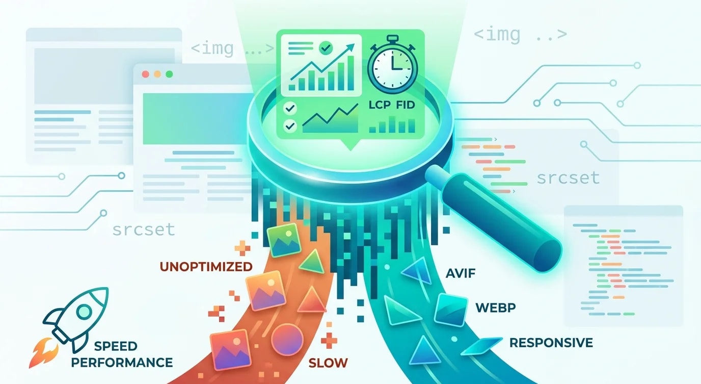
Images account for the majority of bytes transferred on most web pages. Serving a 2400px hero image to a 375px mobile screen wastes bandwidth, kills performance scores, and frustrates users on slower connections. Yet most developers still ship a single image size and call it done.
Responsive images solve this by letting the browser choose the optimal image based on viewport width, pixel density, and format support. The HTML already has the tools—srcset, sizes, and the <picture> element. The challenge is understanding how they work together.
The Problem with Single-Source Images
A single <img> tag forces every device to download the same file, regardless of screen size or capability.
<!-- ❌ One size for all devices -->
<img
  src="/images/hero-2400.jpg"
  alt="Mountain landscape at sunrise"
  width="2400"
  height="1600"
/>
<!--
  Mobile user on 3G: downloads 800KB for a 375px screen
  Desktop user on fiber: gets the right size by accident
  Neither gets modern formats like AVIF or WebP
--><!-- ✅ Responsive with srcset and sizes -->
<img
src="/images/hero-800.jpg"
srcset="
/images/hero-400.jpg 400w,
/images/hero-800.jpg 800w,
/images/hero-1200.jpg 1200w,
/images/hero-1600.jpg 1600w,
/images/hero-2400.jpg 2400w
"
sizes="
(max-width: 640px) 100vw,
(max-width: 1024px) 80vw,
1200px
"
alt="Mountain landscape at sunrise"
width="2400"
height="1600"
loading="lazy"
decoding="async"
/>The srcset attribute tells the browser which image widths are available. The sizes attribute tells the browser how wide the image will be rendered at each breakpoint. The browser combines this information with the device pixel ratio to choose the optimal file.
Understanding srcset and sizes
The w descriptor in srcset communicates the intrinsic width of each image file. The browser uses sizes to determine the rendered width, then picks the best match.
<!--
  How the browser decides:

  Device: iPhone 14 (390px viewport, 3x DPR)
  sizes says: at max-width 640px → 100vw → 390px
  Effective pixels needed: 390 × 3 = 1170px
  Browser picks: hero-1200.jpg (closest match ≥ 1170)

  Device: MacBook Pro (1440px viewport, 2x DPR)
  sizes says: at max-width 1024px? No.
  Falls through to default: 1200px
  Effective pixels needed: 1200 × 2 = 2400px
  Browser picks: hero-2400.jpg
-->

<img
  src="/images/hero-800.jpg"
  srcset="
    /images/hero-400.jpg   400w,
    /images/hero-800.jpg   800w,
    /images/hero-1200.jpg 1200w,
    /images/hero-1600.jpg 1600w,
    /images/hero-2400.jpg 2400w
  "
  sizes="
    (max-width: 640px) 100vw,
    (max-width: 1024px) 80vw,
    1200px
  "
  alt="Dashboard analytics view"
  width="2400"
  height="1600"
/>
Common mistake: setting sizes to 100vw always. On desktop, images inside a container are rarely full viewport width. Inaccurate sizes cause the browser to download images that are too large.
<!-- ❌ sizes always 100vw wastes bandwidth on desktop -->
<img
  srcset="
    /images/card-400.jpg 400w,
    /images/card-800.jpg 800w
  "
  sizes="100vw"
  alt="Product card"
/>

<!-- ✅ Accurate sizes match actual layout -->
<img
  srcset="
    /images/card-400.jpg 400w,
    /images/card-800.jpg 800w
  "
  sizes="
    (max-width: 640px) 100vw,
    (max-width: 1024px) 50vw,
    33vw
  "
  alt="Product card"
/>
The Picture Element for Format Negotiation
While srcset handles resolution switching, <picture> handles format negotiation and art direction. The browser picks the first <source> it supports.
<picture>
  <!-- AVIF: smallest file, newest format -->
  <source
    type="image/avif"
    srcset="
      /images/hero-400.avif   400w,
      /images/hero-800.avif   800w,
      /images/hero-1200.avif 1200w,
      /images/hero-1600.avif 1600w
    "
    sizes="(max-width: 640px) 100vw, 1200px"
  />
  <!-- WebP: good compression, wide support -->
  <source
    type="image/webp"
    srcset="
      /images/hero-400.webp   400w,
      /images/hero-800.webp   800w,
      /images/hero-1200.webp 1200w,
      /images/hero-1600.webp 1600w
    "
    sizes="(max-width: 640px) 100vw, 1200px"
  />
  <!-- JPEG fallback: universal support -->
  <img
    src="/images/hero-800.jpg"
    srcset="
      /images/hero-400.jpg   400w,
      /images/hero-800.jpg   800w,
      /images/hero-1200.jpg 1200w,
      /images/hero-1600.jpg 1600w
    "
    sizes="(max-width: 640px) 100vw, 1200px"
    alt="Mountain landscape at sunrise"
    width="1600"
    height="1067"
    loading="lazy"
    decoding="async"
  />
</picture>
AVIF typically achieves 50% smaller files than JPEG at equivalent visual quality. WebP sits between the two. By listing AVIF first, browsers that support it get the smallest files while older browsers fall through to WebP or JPEG.
Art Direction with Media Queries
Sometimes different viewports need fundamentally different image crops, not just different resolutions. A wide landscape hero on desktop might need a square crop on mobile to keep the subject visible.
<picture>
  <!-- Mobile: square crop focused on subject -->
  <source
    media="(max-width: 640px)"
    srcset="
      /images/hero-mobile-400.avif  400w,
      /images/hero-mobile-800.avif  800w
    "
    sizes="100vw"
    type="image/avif"
  />
  <source
    media="(max-width: 640px)"
    srcset="
      /images/hero-mobile-400.webp  400w,
      /images/hero-mobile-800.webp  800w
    "
    sizes="100vw"
    type="image/webp"
  />
  <!-- Desktop: wide landscape -->
  <source
    srcset="
      /images/hero-desktop-1200.avif 1200w,
      /images/hero-desktop-1600.avif 1600w,
      /images/hero-desktop-2400.avif 2400w
    "
    sizes="100vw"
    type="image/avif"
  />
  <img
    src="/images/hero-desktop-1200.jpg"
    srcset="
      /images/hero-desktop-1200.jpg 1200w,
      /images/hero-desktop-1600.jpg 1600w,
      /images/hero-desktop-2400.jpg 2400w
    "
    sizes="100vw"
    alt="Team collaborating in an open office"
    width="2400"
    height="800"
  />
</picture>
Automating Image Generation with Sharp
Manually creating multiple sizes and formats is unsustainable. Automate with Sharp in a build script.
import sharp from "sharp";
import { readdir, mkdir } from "node:fs/promises";
import { join, parse } from "node:path";

const INPUT_DIR = "images/originals";
const OUTPUT_DIR = "public/images";
const WIDTHS = [400, 800, 1200, 1600, 2400];
const FORMATS = ["avif", "webp", "jpg"] as const;

type ImageFormat = (typeof FORMATS)[number];

const FORMAT_OPTIONS: Record<ImageFormat, object> = {
  avif: { quality: 60, effort: 6 },
  webp: { quality: 75, effort: 5 },
  jpg: { quality: 80, mozjpeg: true },
};

async function processImage(
  inputPath: string
): Promise<void> {
  const { name } = parse(inputPath);
  const image = sharp(inputPath);
  const metadata = await image.metadata();
  const originalWidth = metadata.width ?? 2400;

  for (const format of FORMATS) {
    for (const width of WIDTHS) {
      if (width > originalWidth) continue;

      const outputPath = join(
        OUTPUT_DIR,
        `${name}-${width}.${format}`
      );

      await sharp(inputPath)
        .resize(width, null, {
          withoutEnlargement: true,
          fit: "inside",
        })
        .toFormat(format, FORMAT_OPTIONS[format])
        .toFile(outputPath);

      console.log(`  ✅ ${name}-${width}.${format}`);
    }
  }
}

async function main() {
  await mkdir(OUTPUT_DIR, { recursive: true });

  const files = await readdir(INPUT_DIR);
  const images = files.filter((f) =>
    /\.(jpg|jpeg|png|tiff)$/i.test(f)
  );

  console.log(
    `Processing ${images.length} images...\n`
  );

  for (const file of images) {
    console.log(`📸 ${file}`);
    await processImage(join(INPUT_DIR, file));
  }

  console.log("\n✅ All images processed");
}

main();
Implementing in React/Next.js
Modern frameworks often abstract responsive images, but understanding the underlying HTML helps when the abstraction falls short.
// ResponsiveImage.tsx
interface ImageProps {
  src: string; // base name without extension
  alt: string;
  width: number;
  height: number;
  sizes: string;
  priority?: boolean;
  className?: string;
}

const WIDTHS = [400, 800, 1200, 1600, 2400];

function buildSrcSet(
  base: string,
  format: string
): string {
  return WIDTHS.map(
    (w) => `/images/${base}-${w}.${format} ${w}w`
  ).join(", ");
}

export function ResponsiveImage({
  src,
  alt,
  width,
  height,
  sizes,
  priority = false,
  className,
}: ImageProps) {
  return (
    <picture>
      <source
        type="image/avif"
        srcSet={buildSrcSet(src, "avif")}
        sizes={sizes}
      />
      <source
        type="image/webp"
        srcSet={buildSrcSet(src, "webp")}
        sizes={sizes}
      />
      <img
        src={`/images/${src}-800.jpg`}
        srcSet={buildSrcSet(src, "jpg")}
        sizes={sizes}
        alt={alt}
        width={width}
        height={height}
        loading={priority ? "eager" : "lazy"}
        decoding={priority ? "sync" : "async"}
        fetchPriority={priority ? "high" : "auto"}
        className={className}
      />
    </picture>
  );
}

// Usage
<ResponsiveImage
  src="hero-landscape"
  alt="Mountain landscape at sunrise"
  width={2400}
  height={1600}
  sizes="(max-width: 640px) 100vw, 1200px"
  priority
/>
Key Takeaways
Use srcset with width descriptors (w) to provide multiple image resolutions and sizes to tell the browser the rendered width at each breakpoint—accurate sizes are critical because the browser uses them to calculate which image to download before layout occurs. The <picture> element handles format negotiation by listing sources in order of preference (AVIF first, then WebP, then JPEG fallback), letting each browser download the most efficient format it supports. Art direction requires separate <source> elements with media attributes when different viewports need different crops—resolution switching with srcset only scales the same image, it does not change the composition. Automate image generation with tools like Sharp to create all size and format variants from source files during build time, eliminating manual image processing and ensuring consistent output across every image in the project.