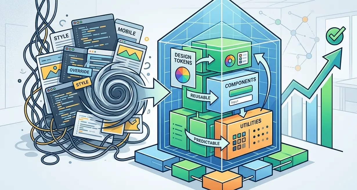
Design Tokens: Bridging Design and Development Systems
How design tokens create one source of truth for colors, spacing and typography across design tools and code, ending drift between Figma and production.

Design systems fail when designers update a color in Figma and developers never learn about it. Or when developers add a new spacing value that does not exist in the design spec. Design tokens solve this by establishing a single source of truth — platform-agnostic values that both tools and code consume.
A design token is a named value: color-primary-500: #3B82F6. That value gets transformed into CSS custom properties, Tailwind config, iOS Swift constants, and Android XML resources. Change the token, and every platform updates.
What Tokens Look Like
Tokens are typically stored in JSON or YAML, following the emerging W3C Design Tokens specification.
{
  "color": {
    "primary": {
      "100": { "$value": "#DBEAFE", "$type": "color" },
      "300": { "$value": "#93C5FD", "$type": "color" },
      "500": { "$value": "#3B82F6", "$type": "color" },
      "700": { "$value": "#1D4ED8", "$type": "color" },
      "900": { "$value": "#1E3A8A", "$type": "color" }
    },
    "neutral": {
      "50":  { "$value": "#F9FAFB", "$type": "color" },
      "200": { "$value": "#E5E7EB", "$type": "color" },
      "500": { "$value": "#6B7280", "$type": "color" },
      "800": { "$value": "#1F2937", "$type": "color" },
      "950": { "$value": "#030712", "$type": "color" }
    }
  },
  "spacing": {
    "xs":  { "$value": "4px",  "$type": "dimension" },
    "sm":  { "$value": "8px",  "$type": "dimension" },
    "md":  { "$value": "16px", "$type": "dimension" },
    "lg":  { "$value": "24px", "$type": "dimension" },
    "xl":  { "$value": "32px", "$type": "dimension" },
    "2xl": { "$value": "48px", "$type": "dimension" }
  },
  "font": {
    "family": {
      "sans":  { "$value": "Inter, system-ui, sans-serif", "$type": "fontFamily" },
      "mono":  { "$value": "JetBrains Mono, monospace", "$type": "fontFamily" }
    },
    "size": {
      "sm":   { "$value": "14px", "$type": "dimension" },
      "base": { "$value": "16px", "$type": "dimension" },
      "lg":   { "$value": "18px", "$type": "dimension" },
      "xl":   { "$value": "20px", "$type": "dimension" },
      "2xl":  { "$value": "24px", "$type": "dimension" },
      "4xl":  { "$value": "36px", "$type": "dimension" }
    }
  }
}
This JSON is the source. Everything else is generated from it.
Token Transformation with Style Dictionary
Style Dictionary is the standard tool for transforming tokens into platform-specific outputs. One source file produces CSS, JavaScript, TypeScript, and native mobile formats.
// style-dictionary.config.js
const StyleDictionary = require('style-dictionary');

module.exports = {
  source: ['tokens/**/*.json'],
  platforms: {
    css: {
      transformGroup: 'css',
      buildPath: 'dist/css/',
      files: [{
        destination: 'tokens.css',
        format: 'css/variables',
        options: { outputReferences: true },
      }],
    },
    js: {
      transformGroup: 'js',
      buildPath: 'dist/js/',
      files: [{
        destination: 'tokens.js',
        format: 'javascript/es6',
      }],
    },
    typescript: {
      transformGroup: 'js',
      buildPath: 'dist/ts/',
      files: [{
        destination: 'tokens.ts',
        format: 'javascript/es6',
      }],
    },
    tailwind: {
      transformGroup: 'js',
      buildPath: 'dist/tailwind/',
      files: [{
        destination: 'tailwind-tokens.js',
        format: 'javascript/module',
      }],
    },
  },
};
Running style-dictionary build produces these outputs:
/* dist/css/tokens.css */
:root {
  --color-primary-100: #DBEAFE;
  --color-primary-300: #93C5FD;
  --color-primary-500: #3B82F6;
  --color-primary-700: #1D4ED8;
  --color-primary-900: #1E3A8A;
  --spacing-xs: 4px;
  --spacing-sm: 8px;
  --spacing-md: 16px;
  --spacing-lg: 24px;
  --font-family-sans: Inter, system-ui, sans-serif;
  --font-size-base: 16px;
}// dist/ts/tokens.ts
export const ColorPrimary100 = "#DBEAFE";
export const ColorPrimary500 = "#3B82F6";
export const SpacingMd = "16px";
export const FontFamilySans = "Inter, system-ui, sans-serif";Token Layers: Global, Semantic, Component
Raw values like #3B82F6 are global tokens. They need a semantic layer that describes intent, and a component layer that maps to specific UI elements.
{
  "color": {
    "global": {
      "blue-500": { "$value": "#3B82F6" },
      "red-500":  { "$value": "#EF4444" },
      "green-500": { "$value": "#22C55E" },
      "gray-800": { "$value": "#1F2937" },
      "gray-50":  { "$value": "#F9FAFB" }
    },
    "semantic": {
      "action": { "$value": "{color.global.blue-500}" },
      "error":  { "$value": "{color.global.red-500}" },
      "success": { "$value": "{color.global.green-500}" },
      "text-primary": { "$value": "{color.global.gray-800}" },
      "bg-primary":   { "$value": "{color.global.gray-50}" }
    },
    "component": {
      "button-bg":       { "$value": "{color.semantic.action}" },
      "button-bg-hover":  { "$value": "{color.global.blue-700}" },
      "alert-error-bg":  { "$value": "{color.semantic.error}" },
      "input-border":    { "$value": "{color.global.gray-300}" }
    }
  }
}/* ❌ Using global tokens directly in components */
.button {
background: var(--color-global-blue-500);
/* What happens when the brand color changes to purple? */
/* You grep the entire codebase for blue-500 */
}
/* ✅ Using semantic/component tokens */
.button {
background: var(--color-button-bg);
/* Brand change = update one token mapping */
}The three-layer approach means a rebrand requires changing only the semantic-to-global mappings. No component code changes, no CSS file edits.
Dark Mode Through Token Aliases
Dark mode becomes trivial when tokens use semantic naming. Swap the global values behind semantic tokens.
{
  "color": {
    "semantic": {
      "text-primary": {
        "$value": "{color.global.gray-900}",
        "$extensions": {
          "dark": "{color.global.gray-100}"
        }
      },
      "bg-primary": {
        "$value": "{color.global.white}",
        "$extensions": {
          "dark": "{color.global.gray-900}"
        }
      },
      "bg-surface": {
        "$value": "{color.global.gray-50}",
        "$extensions": {
          "dark": "{color.global.gray-800}"
        }
      }
    }
  }
}/* Generated CSS with dark mode support */
:root {
--color-text-primary: #111827;
--color-bg-primary: #FFFFFF;
--color-bg-surface: #F9FAFB;
}
@media (prefers-color-scheme: dark) {
:root {
--color-text-primary: #F3F4F6;
--color-bg-primary: #111827;
--color-bg-surface: #1F2937;
}
}
/* Or class-based toggling */
[data-theme="dark"] {
--color-text-primary: #F3F4F6;
--color-bg-primary: #111827;
--color-bg-surface: #1F2937;
}Every component that uses var(--color-text-primary) automatically adapts to dark mode. No conditional CSS, no theme-specific stylesheets, no JavaScript toggling.
Integrating Tokens with Tailwind CSS
Tailwind projects can consume design tokens by generating the Tailwind config from token files.
// tailwind.config.js
const tokens = require('./dist/tailwind/tailwind-tokens');

module.exports = {
  theme: {
    colors: {
      primary: {
        100: tokens.ColorPrimary100,
        300: tokens.ColorPrimary300,
        500: tokens.ColorPrimary500,
        700: tokens.ColorPrimary700,
        900: tokens.ColorPrimary900,
      },
      neutral: {
        50:  tokens.ColorNeutral50,
        200: tokens.ColorNeutral200,
        500: tokens.ColorNeutral500,
        800: tokens.ColorNeutral800,
      },
    },
    spacing: {
      xs: tokens.SpacingXs,
      sm: tokens.SpacingSm,
      md: tokens.SpacingMd,
      lg: tokens.SpacingLg,
      xl: tokens.SpacingXl,
    },
    fontFamily: {
      sans: [tokens.FontFamilySans],
      mono: [tokens.FontFamilyMono],
    },
  },
};// Components use Tailwind classes backed by tokens
function Card({ title, children }: CardProps) {
return (
<div className="bg-neutral-50 rounded-lg p-lg shadow-sm">
<h3 className="text-primary-900 font-sans text-xl mb-sm">
{title}
</h3>
<div className="text-neutral-800">{children}</div>
</div>
);
}Now bg-neutral-50 resolves to the token value, not a hardcoded color. Changing the neutral palette updates Tailwind output automatically.
The Token Pipeline in CI
Tokens should be built and validated in CI before merging. A broken token file should fail the build the same way a broken component would.
# .github/workflows/tokens.yml
name: Build Design Tokens
on:
  pull_request:
    paths:
      - 'tokens/**'
      - 'style-dictionary.config.js'

jobs:
  build-tokens:
    runs-on: ubuntu-latest
    steps:
      - uses: actions/checkout@v3

      - name: Install dependencies
        run: npm ci

      - name: Validate token schema
        run: npx ajv validate -s tokens/schema.json -d "tokens/**/*.json"

      - name: Build tokens
        run: npx style-dictionary build

      - name: Check for uncommitted changes
        run: |
          git diff --exit-code dist/
echo "Token outputs are up to date"# Pre-commit hook — rebuild tokens when source changes
#!/bin/sh
# .husky/pre-commit
CHANGED=$(git diff --cached --name-only -- 'tokens/')
if [ -n "$CHANGED" ]; then
npx style-dictionary build
git add dist/
fiThis ensures token outputs in dist/ always match the source files. If a developer changes a token but forgets to rebuild, CI catches it.
Key Takeaways
- Tokens are the single source of truth — one JSON file generates CSS, JS, Tailwind, and native mobile formats
- Use three layers: global, semantic, component — never reference raw color values in component code
- Dark mode is a token swap — semantic tokens make theming automatic with no component changes
- Style Dictionary handles transformation — define once, output everywhere
- Validate tokens in CI — broken tokens break UI, treat them like code
- Feed tokens into Tailwind config — class-based styling backed by design system values instead of arbitrary numbers