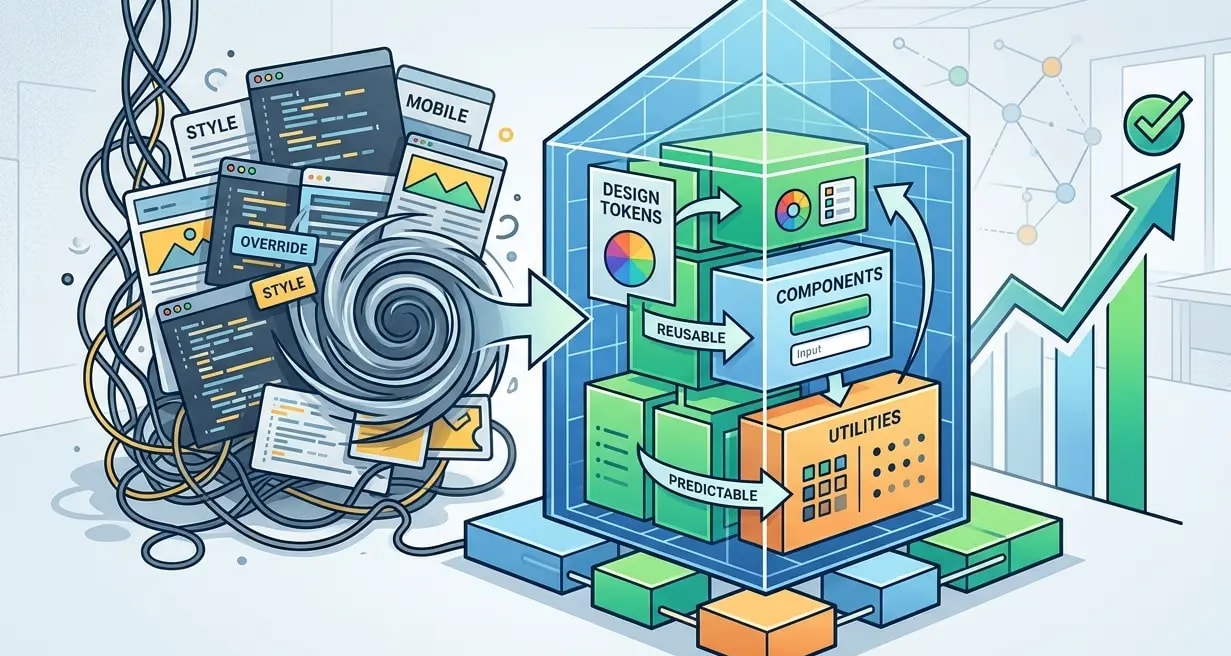
Design Tokens: Brücke zwischen Design- und Entwicklungssystemen
Wie Design Tokens eine einzige Quelle der Wahrheit für Farben, Abstände und Typografie schaffen und Drift zwischen Figma und Produktion verhindern.

Designsysteme scheitern, wenn Designer:innen eine Farbe in Figma ändern und Entwickler:innen nie davon erfahren. Oder wenn Entwickler:innen einen neuen Abstandswert hinzufügen, der im Design-Spec nicht existiert. Design Tokens lösen das, indem sie eine einzige Quelle der Wahrheit etablieren – plattformunabhängige Werte, die sowohl Tools als auch Code konsumieren.
Ein Design Token ist ein benannter Wert: color-primary-500: #3B82F6. Dieser Wert wird in CSS-Custom-Properties, Tailwind-Config, iOS-Swift-Konstanten und Android-XML-Ressourcen transformiert. Ändere den Token und jede Plattform aktualisiert sich.
Wie Tokens aussehen
Tokens werden typischerweise in JSON oder YAML gespeichert und folgen der entstehenden W3C-Spezifikation für Design Tokens.
{
  "color": {
    "primary": {
      "100": { "$value": "#DBEAFE", "$type": "color" },
      "300": { "$value": "#93C5FD", "$type": "color" },
      "500": { "$value": "#3B82F6", "$type": "color" },
      "700": { "$value": "#1D4ED8", "$type": "color" },
      "900": { "$value": "#1E3A8A", "$type": "color" }
    },
    "neutral": {
      "50":  { "$value": "#F9FAFB", "$type": "color" },
      "200": { "$value": "#E5E7EB", "$type": "color" },
      "500": { "$value": "#6B7280", "$type": "color" },
      "800": { "$value": "#1F2937", "$type": "color" },
      "950": { "$value": "#030712", "$type": "color" }
    }
  },
  "spacing": {
    "xs":  { "$value": "4px",  "$type": "dimension" },
    "sm":  { "$value": "8px",  "$type": "dimension" },
    "md":  { "$value": "16px", "$type": "dimension" },
    "lg":  { "$value": "24px", "$type": "dimension" },
    "xl":  { "$value": "32px", "$type": "dimension" },
    "2xl": { "$value": "48px", "$type": "dimension" }
  },
  "font": {
    "family": {
      "sans":  { "$value": "Inter, system-ui, sans-serif", "$type": "fontFamily" },
      "mono":  { "$value": "JetBrains Mono, monospace", "$type": "fontFamily" }
    },
    "size": {
      "sm":   { "$value": "14px", "$type": "dimension" },
      "base": { "$value": "16px", "$type": "dimension" },
      "lg":   { "$value": "18px", "$type": "dimension" },
      "xl":   { "$value": "20px", "$type": "dimension" },
      "2xl":  { "$value": "24px", "$type": "dimension" },
      "4xl":  { "$value": "36px", "$type": "dimension" }
    }
  }
}
Diese JSON-Datei ist die Quelle. Alles andere wird daraus generiert.
Token-Transformation mit Style Dictionary
Style Dictionary ist das Standard-Tool, um Tokens in plattformspezifische Ausgaben zu transformieren. Eine Quelldatei erzeugt CSS, JavaScript, TypeScript und native Mobile-Formate.
// style-dictionary.config.js
const StyleDictionary = require('style-dictionary');

module.exports = {
  source: ['tokens/**/*.json'],
  platforms: {
    css: {
      transformGroup: 'css',
      buildPath: 'dist/css/',
      files: [{
        destination: 'tokens.css',
        format: 'css/variables',
        options: { outputReferences: true },
      }],
    },
    js: {
      transformGroup: 'js',
      buildPath: 'dist/js/',
      files: [{
        destination: 'tokens.js',
        format: 'javascript/es6',
      }],
    },
    typescript: {
      transformGroup: 'js',
      buildPath: 'dist/ts/',
      files: [{
        destination: 'tokens.ts',
        format: 'javascript/es6',
      }],
    },
    tailwind: {
      transformGroup: 'js',
      buildPath: 'dist/tailwind/',
      files: [{
        destination: 'tailwind-tokens.js',
        format: 'javascript/module',
      }],
    },
  },
};
style-dictionary build ausführen erzeugt diese Ausgaben:
/* dist/css/tokens.css */
:root {
  --color-primary-100: #DBEAFE;
  --color-primary-300: #93C5FD;
  --color-primary-500: #3B82F6;
  --color-primary-700: #1D4ED8;
  --color-primary-900: #1E3A8A;
  --spacing-xs: 4px;
  --spacing-sm: 8px;
  --spacing-md: 16px;
  --spacing-lg: 24px;
  --font-family-sans: Inter, system-ui, sans-serif;
  --font-size-base: 16px;
}// dist/ts/tokens.ts
export const ColorPrimary100 = "#DBEAFE";
export const ColorPrimary500 = "#3B82F6";
export const SpacingMd = "16px";
export const FontFamilySans = "Inter, system-ui, sans-serif";Token-Ebenen: Global, Semantisch, Komponente
Rohwerte wie #3B82F6 sind globale Tokens. Sie brauchen eine semantische Ebene, die Intent beschreibt, und eine Komponenten-Ebene, die auf spezifische UI-Elemente abbildet.
{
  "color": {
    "global": {
      "blue-500": { "$value": "#3B82F6" },
      "red-500":  { "$value": "#EF4444" },
      "green-500": { "$value": "#22C55E" },
      "gray-800": { "$value": "#1F2937" },
      "gray-50":  { "$value": "#F9FAFB" }
    },
    "semantic": {
      "action": { "$value": "{color.global.blue-500}" },
      "error":  { "$value": "{color.global.red-500}" },
      "success": { "$value": "{color.global.green-500}" },
      "text-primary": { "$value": "{color.global.gray-800}" },
      "bg-primary":   { "$value": "{color.global.gray-50}" }
    },
    "component": {
      "button-bg":       { "$value": "{color.semantic.action}" },
      "button-bg-hover":  { "$value": "{color.global.blue-700}" },
      "alert-error-bg":  { "$value": "{color.semantic.error}" },
      "input-border":    { "$value": "{color.global.gray-300}" }
    }
  }
}/* ❌ Globale Tokens direkt in Komponenten verwenden */
.button {
background: var(--color-global-blue-500);
/* Was passiert, wenn die Markenfarbe auf Lila wechselt? */
/* Du suchst blue-500 im gesamten Codebase */
}
/* ✅ Semantische/Komponenten-Tokens verwenden */
.button {
background: var(--color-button-bg);
/* Markenwechsel = ein Token-Mapping aktualisieren */
}Der Drei-Ebenen-Ansatz bedeutet, dass ein Rebrand nur die semantisch-zu-global-Mappings ändern muss. Keine Komponenten-Code-Änderungen, keine CSS-Datei-Edits.
Dark Mode durch Token-Aliasse
Dark Mode wird trivial, wenn Tokens semantische Namen verwenden. Tausche die globalen Werte hinter semantischen Tokens aus.
{
  "color": {
    "semantic": {
      "text-primary": {
        "$value": "{color.global.gray-900}",
        "$extensions": {
          "dark": "{color.global.gray-100}"
        }
      },
      "bg-primary": {
        "$value": "{color.global.white}",
        "$extensions": {
          "dark": "{color.global.gray-900}"
        }
      },
      "bg-surface": {
        "$value": "{color.global.gray-50}",
        "$extensions": {
          "dark": "{color.global.gray-800}"
        }
      }
    }
  }
}/* Generiertes CSS mit Dark-Mode-Support */
:root {
--color-text-primary: #111827;
--color-bg-primary: #FFFFFF;
--color-bg-surface: #F9FAFB;
}
@media (prefers-color-scheme: dark) {
:root {
--color-text-primary: #F3F4F6;
--color-bg-primary: #111827;
--color-bg-surface: #1F2937;
}
}
/* Oder klassenbasiertes Umschalten */
[data-theme="dark"] {
--color-text-primary: #F3F4F6;
--color-bg-primary: #111827;
--color-bg-surface: #1F2937;
}Jede Komponente, die var(--color-text-primary) verwendet, passt sich automatisch an den Dark Mode an. Kein bedingtes CSS, keine theme-spezifischen Stylesheets, kein JavaScript-Umschalten.
Integration von Tokens mit Tailwind CSS
Tailwind-Projekte können Design Tokens konsumieren, indem sie die Tailwind-Config aus Token-Dateien generieren.
// tailwind.config.js
const tokens = require('./dist/tailwind/tailwind-tokens');

module.exports = {
  theme: {
    colors: {
      primary: {
        100: tokens.ColorPrimary100,
        300: tokens.ColorPrimary300,
        500: tokens.ColorPrimary500,
        700: tokens.ColorPrimary700,
        900: tokens.ColorPrimary900,
      },
      neutral: {
        50:  tokens.ColorNeutral50,
        200: tokens.ColorNeutral200,
        500: tokens.ColorNeutral500,
        800: tokens.ColorNeutral800,
      },
    },
    spacing: {
      xs: tokens.SpacingXs,
      sm: tokens.SpacingSm,
      md: tokens.SpacingMd,
      lg: tokens.SpacingLg,
      xl: tokens.SpacingXl,
    },
    fontFamily: {
      sans: [tokens.FontFamilySans],
      mono: [tokens.FontFamilyMono],
    },
  },
};// Components use Tailwind classes backed by tokens
function Card({ title, children }: CardProps) {
return (
<div className="bg-neutral-50 rounded-lg p-lg shadow-sm">
<h3 className="text-primary-900 font-sans text-xl mb-sm">
{title}
</h3>
<div className="text-neutral-800">{children}</div>
</div>
);
}Nun wird bg-neutral-50 auf den Token-Wert aufgelöst, nicht auf eine hartcodierte Farbe. Eine Änderung der neutralen Palette aktualisiert die Tailwind-Ausgabe automatisch.
Die Token-Pipeline in CI
Tokens sollten in CI gebaut und validiert werden, bevor gemerged wird. Eine defekte Token-Datei sollte den Build genauso fehlschlagen lassen wie eine defekte Komponente.
# .github/workflows/tokens.yml
name: Build Design Tokens
on:
  pull_request:
    paths:
      - 'tokens/**'
      - 'style-dictionary.config.js'

jobs:
  build-tokens:
    runs-on: ubuntu-latest
    steps:
      - uses: actions/checkout@v3

      - name: Abhängigkeiten installieren
        run: npm ci

      - name: Token-Schema validieren
        run: npx ajv validate -s tokens/schema.json -d "tokens/**/*.json"

      - name: Tokens bauen
        run: npx style-dictionary build

      - name: Auf nicht committete Änderungen prüfen
        run: |
          git diff --exit-code dist/
echo "Token-Ausgaben sind aktuell"# Pre-commit-Hook — Tokens neu bauen, wenn sich die Quelle ändert
#!/bin/sh
# .husky/pre-commit
CHANGED=$(git diff --cached --name-only -- 'tokens/')
if [ -n "$CHANGED" ]; then
npx style-dictionary build
git add dist/
fiDas stellt sicher, dass die Token-Ausgaben in dist/ immer mit den Quelldateien übereinstimmen. Wenn ein:e Entwickler:in einen Token ändert, aber vergisst neu zu bauen, fängt CI das ab.
Wichtige Erkenntnisse
- Tokens sind die einzige Quelle der Wahrheit — eine JSON-Datei erzeugt CSS, JS, Tailwind und native Mobile-Formate
- Drei Ebenen verwenden: global, semantisch, Komponente — niemals Rohfarbwerte im Komponenten-Code referenzieren
- Dark Mode ist ein Token-Tausch — semantische Tokens machen Theming automatisch ohne Komponenten-Änderungen
- Style Dictionary übernimmt die Transformation — einmal definieren, überall ausgeben
- Tokens in CI validieren — defekte Tokens zerstören die UI; behandle sie wie Code
- Tokens in die Tailwind-Config einspeisen — klassenbasiertes Styling mit Design-System-Werten statt willkürlicher Zahlen