
Frontend
Micro Frontends Architecture Guide
A practical guide to micro frontends — splitting a monolithic frontend into independently deployable pieces using Module Federation, routing-based composition, and shared design systems.
·4 min read
Categories
UI & user experience · 38 articles · Page 3 of 4
A practical guide to micro frontends — splitting a monolithic frontend into independently deployable pieces using Module Federation, routing-based composition, and shared design systems.

A practical introduction to WebAssembly for web developers — covering what it is, when to use it over JavaScript, how to compile from Rust and C, and integrating Wasm modules into web applications.

A practical guide to image optimization for the web — covering modern formats, responsive images, lazy loading, CDN delivery, and measuring the real impact on Core Web Vitals.

How to design custom React hooks that are truly reusable — covering composition patterns, testing strategies, state encapsulation, and common anti-patterns to avoid.

How to build truly accessible React components — covering ARIA attributes, keyboard navigation, focus management, and screen reader testing patterns.

How CSS container queries let components respond to their parent's size instead of the viewport — enabling truly reusable responsive components.

How design tokens create a single source of truth for colors, spacing, and typography across design tools and code — eliminating drift between Figma and production.

Practical code splitting techniques using Webpack and dynamic imports to reduce initial bundle size and improve page load performance.
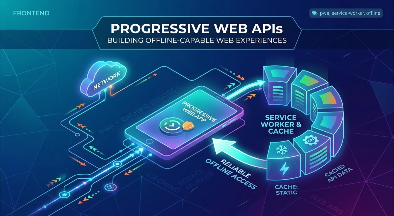
A practical guide to building progressive web apps with service workers, caching strategies, and installability that work reliably offline.

How to define, measure, and enforce performance budgets that prevent your web application from silently degrading over time.

Practical accessibility patterns that improve usability for everyone while keeping your app legally compliant and semantically correct.

Container queries, fluid typography, intrinsic sizing, and CSS clamp() — modern responsive design techniques that reduce media query dependency and create truly flexible layouts.