
Frontend
Responsive Images: srcset, sizes and Modern Formats
Master responsive image delivery with srcset, sizes, the picture element and modern formats like AVIF and WebP — faster pages, same visual quality.
·5 min read
Tags
33 articles · Page 2 of 3
Master responsive image delivery with srcset, sizes, the picture element and modern formats like AVIF and WebP — faster pages, same visual quality.

Advanced CSS Grid in production: subgrid, named areas with responsive reflow, auto-placement, intrinsic sizing with minmax and grid-aware components.
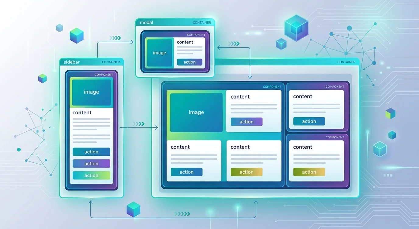
How CSS container queries let you build components that adapt to their parent's size rather than the viewport, producing UI modules portable to any layout.

Build error boundary strategies that catch failures gracefully, provide meaningful fallbacks, report actionable diagnostics and contain the damage.

Master GPU-accelerated CSS and JavaScript animation techniques that hold a steady 60fps without layout thrashing or janky frame drops.

How to implement Content Security Policy headers that actually protect you: directive syntax, nonce-based inline scripts, reporting and safe rollout.

How to build framework-agnostic web components with Custom Elements, Shadow DOM and HTML templates — reusable UI elements that work anywhere.

A practical guide to micro frontends: splitting a monolithic frontend into independently deployable pieces with Module Federation and shared design systems.
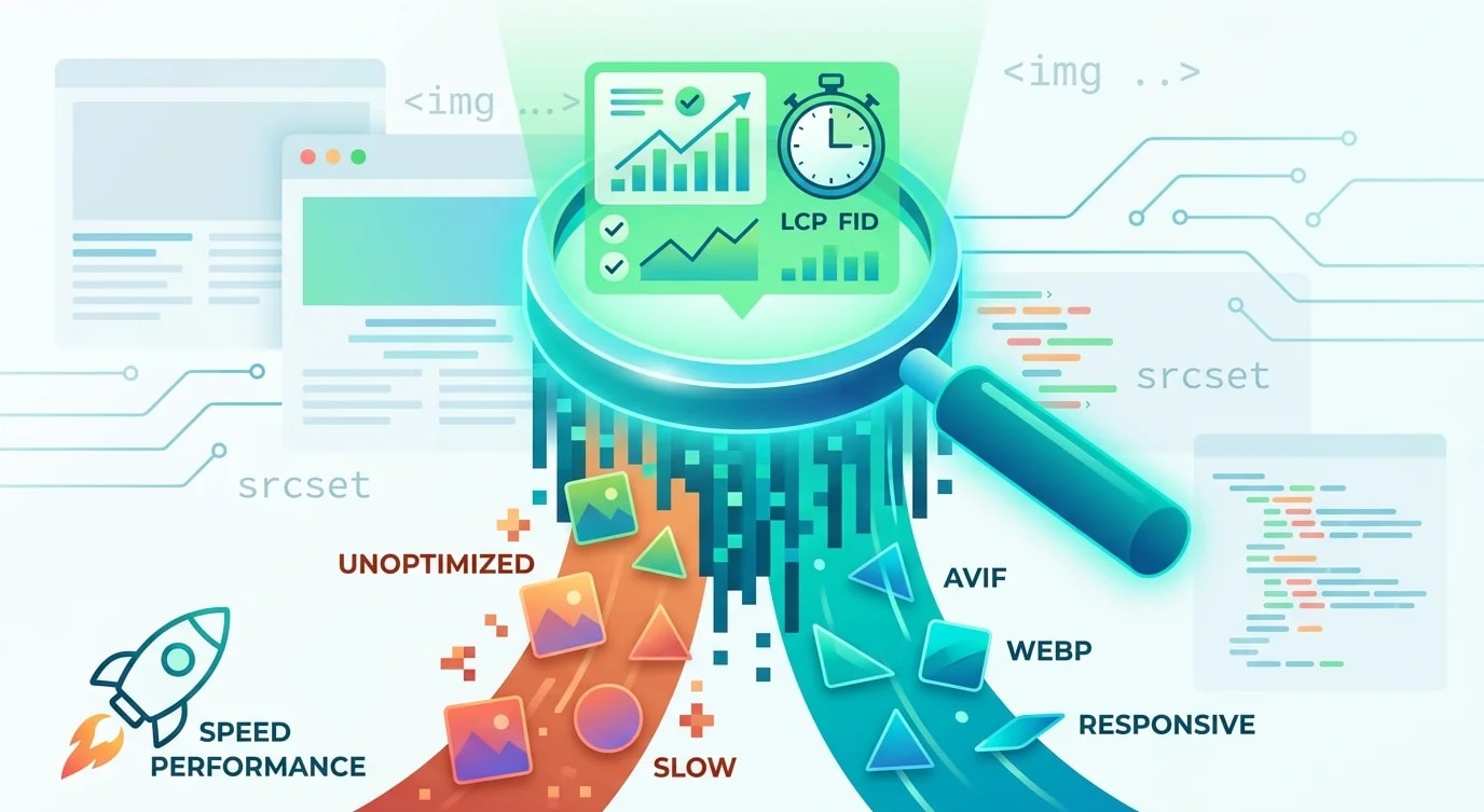
A practical guide to image optimization for the web: modern formats, responsive images, lazy loading, CDN delivery and the real Core Web Vitals impact.
How to design custom React hooks that are genuinely reusable: composition patterns, testing strategies, state encapsulation and the anti-patterns to avoid.

How to build truly accessible React components — covering ARIA attributes, keyboard navigation, focus management, and screen reader testing patterns.

How CSS container queries let components respond to their parent's size instead of the viewport — enabling truly reusable responsive components.