Modern Responsive Design: Beyond Media Queries
Container queries, fluid typography, intrinsic sizing and CSS clamp(): modern responsive techniques that cut media query dependency for flexible layouts.

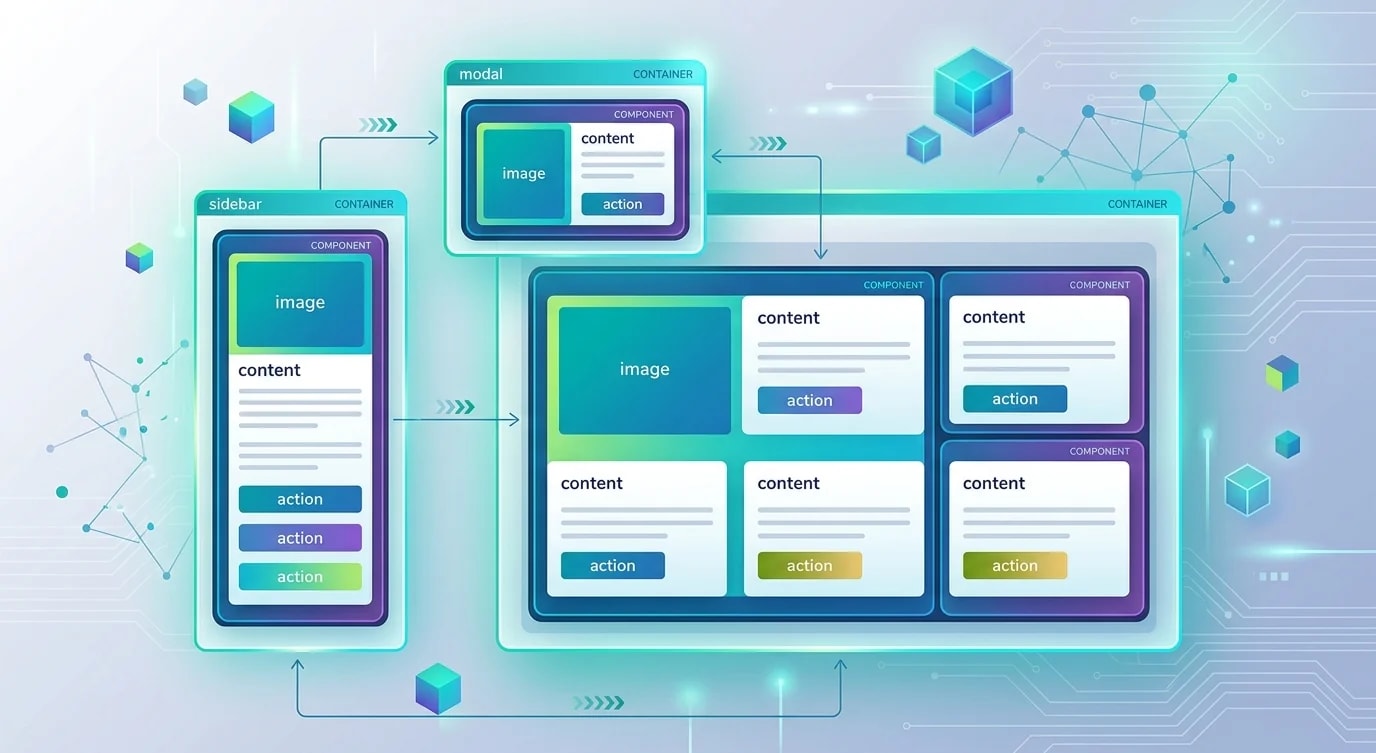
Responsive design started with media queries: define breakpoints at specific viewport widths and rearrange layouts. This approach works but creates rigid, viewport-dependent designs. Modern CSS provides tools for intrinsic responsiveness — components that adapt to their container size, text that scales fluidly, and layouts that respond to available space without hardcoded breakpoints.
Fluid Typography with clamp()
Instead of jumping between font sizes at breakpoints, clamp() creates smooth scaling between a minimum and maximum size.
/* ❌ Abrupt font size changes at breakpoints */
h1 { font-size: 1.5rem; }
@media (min-width: 768px) { h1 { font-size: 2rem; } }
@media (min-width: 1200px) { h1 { font-size: 3rem; } }

/* ✅ Fluid scaling — smooth transition between min and max */
h1 {
  /* Minimum 1.5rem, preferred 4vw, maximum 3rem */
  font-size: clamp(1.5rem, 4vw, 3rem);
}

/* Complete fluid type scale */
:root {
  --text-xs: clamp(0.75rem, 0.7rem + 0.25vw, 0.875rem);
  --text-sm: clamp(0.875rem, 0.8rem + 0.35vw, 1rem);
  --text-base: clamp(1rem, 0.9rem + 0.5vw, 1.125rem);
  --text-lg: clamp(1.125rem, 1rem + 0.6vw, 1.375rem);
  --text-xl: clamp(1.25rem, 1rem + 1.2vw, 1.75rem);
  --text-2xl: clamp(1.5rem, 1.1rem + 2vw, 2.5rem);
  --text-3xl: clamp(1.875rem, 1.2rem + 3.2vw, 3.5rem);
}
Container Queries
Media queries respond to the viewport. Container queries respond to the parent container's size — enabling truly reusable components.
/* ❌ Media query — this card changes based on viewport width
   Breaks when placed in a narrow sidebar on a wide screen */
.card { display: flex; flex-direction: column; }
@media (min-width: 768px) {
  .card { flex-direction: row; }  /* Horizontal on "tablet+" */
}

/* ✅ Container query — card adapts to its container's width */
.card-container {
  container-type: inline-size;
  container-name: card-wrapper;
}

.card {
  display: flex;
  flex-direction: column;
  gap: 1rem;
}

/* Card goes horizontal when its container is wide enough */
@container card-wrapper (min-width: 500px) {
  .card {
    flex-direction: row;
    align-items: center;
  }

  .card-image {
    width: 200px;
    flex-shrink: 0;
  }
}

@container card-wrapper (min-width: 800px) {
  .card {
    gap: 2rem;
  }

  .card-title {
    font-size: var(--text-xl);
  }
}
Intrinsic Sizing with min(), max(), and clamp()
Combine intrinsic sizing functions for elements that adapt without breakpoints.
/* ❌ Fixed max-width with media queries for padding */
.content {
  max-width: 1200px;
  margin: 0 auto;
  padding: 1rem;
}
@media (min-width: 768px) {
  .content { padding: 2rem; }
}
@media (min-width: 1200px) {
  .content { padding: 4rem; }
}

/* ✅ Fluid container with clamp */
.content {
  width: min(90%, 1200px);  /* 90% of viewport or 1200px, whichever is smaller */
  margin-inline: auto;
  padding-inline: clamp(1rem, 5vw, 4rem);  /* Fluid padding */
}

/* Fluid spacing scale */
:root {
  --space-xs: clamp(0.25rem, 0.2rem + 0.25vw, 0.5rem);
  --space-sm: clamp(0.5rem, 0.4rem + 0.5vw, 0.75rem);
  --space-md: clamp(1rem, 0.8rem + 1vw, 1.5rem);
  --space-lg: clamp(1.5rem, 1rem + 2.5vw, 3rem);
  --space-xl: clamp(2rem, 1.5rem + 3vw, 4rem);
}
Aspect Ratio for Responsive Media
The aspect-ratio property maintains proportions without the padding-top hack.
/* ❌ Padding-top hack for 16:9 aspect ratio */
.video-wrapper {
  position: relative;
  padding-top: 56.25%; /* 9/16 = 0.5625 */
}
.video-wrapper iframe {
  position: absolute;
  top: 0;
  left: 0;
  width: 100%;
  height: 100%;
}

/* ✅ Native aspect-ratio */
.video-wrapper {
  aspect-ratio: 16 / 9;
  width: 100%;
}

.video-wrapper iframe {
  width: 100%;
  height: 100%;
  object-fit: cover;
}

/* Responsive image gallery with consistent proportions */
.gallery-item img {
  width: 100%;
  aspect-ratio: 4 / 3;
  object-fit: cover;
  border-radius: 0.5rem;
}
Logical Properties for Internationalization
Logical properties (inline and block instead of left and right) automatically adapt to different writing directions.
/* ❌ Physical properties — break in RTL languages */
.card {
  margin-left: 1rem;
  padding-right: 2rem;
  text-align: left;
  border-left: 3px solid blue;
}

/* ✅ Logical properties — work in any writing direction */
.card {
  margin-inline-start: 1rem;
  padding-inline-end: 2rem;
  text-align: start;
  border-inline-start: 3px solid blue;
}

/* Shorthand logical properties */
.section {
  margin-block: 2rem;          /* top and bottom in LTR */
  padding-inline: 1.5rem;      /* left and right in LTR */
  border-block-end: 1px solid; /* bottom border in LTR */
}
Combining Techniques
/* A fully intrinsic card component */
.card-grid {
  container-type: inline-size;
  display: grid;
  grid-template-columns: repeat(auto-fit, minmax(280px, 1fr));
  gap: var(--space-md);
  padding: var(--space-lg);
  width: min(95%, 1400px);
  margin-inline: auto;
}

.card {
  display: flex;
  flex-direction: column;
  gap: var(--space-sm);
  padding: var(--space-md);
  border-radius: clamp(0.5rem, 1vw, 1rem);
}

.card-title {
  font-size: var(--text-lg);
  line-height: 1.3;
}

.card-image {
  aspect-ratio: 16 / 9;
  object-fit: cover;
  border-radius: inherit;
}
Key Takeaways
- clamp() creates fluid scaling — typography, spacing, and sizing that smoothly adapts without breakpoint jumps
- Container queries enable reusable components — components respond to their container, not the viewport
- min() and max() for intrinsic sizing —
width: min(90%, 1200px)is cleaner than max-width with margin auto - aspect-ratio replaces the padding hack — native proportional sizing for images and video containers
- Logical properties support internationalization —
inline-startinstead ofleftworks in any writing direction - Combine fluid techniques to minimize media queries — most responsive behavior can be achieved with intrinsic CSS